CASE STUDY
Timeline
3 Months
SECTOR
Mobility and transportation sector
Design Role
UX/UI Design
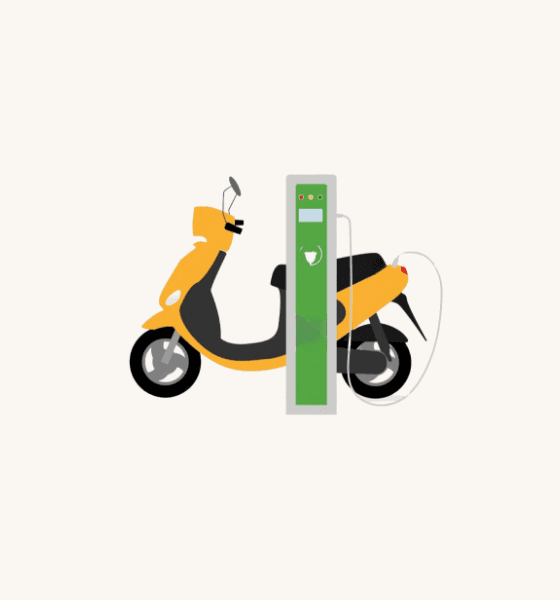
Smart EV Sharing and Renting App

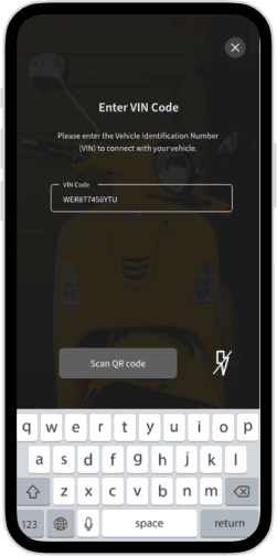
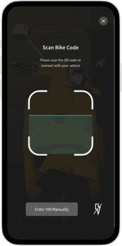
Users could easily add their electric vehicle by scanning the VIN number or entering it manually, with a guided and intuitive process.
Adding Your EV
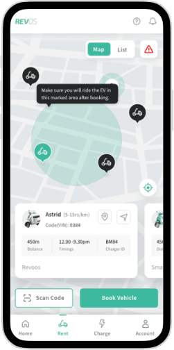
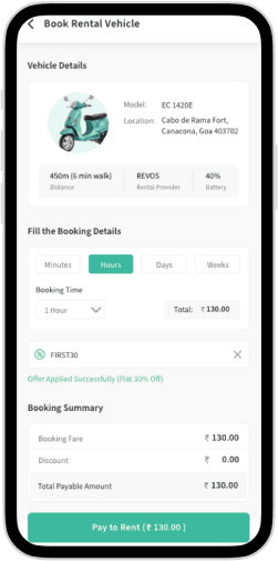
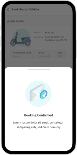
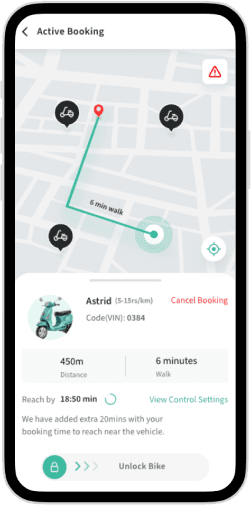
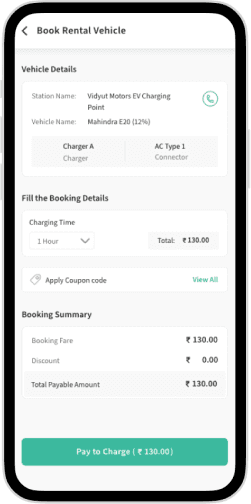
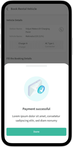
A user-friendly renting process allowed users to effortlessly rent an electric vehicle and complete the transaction within the app.
Rent Bike
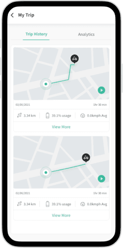
A speedometer feature was included that displayed the user's current speed while driving, designed to be easy to read and use.
Speedometer
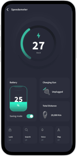
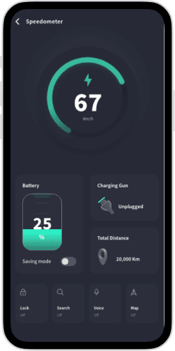
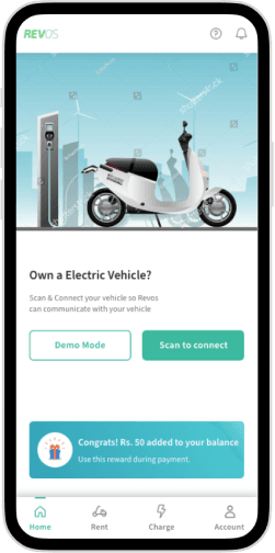
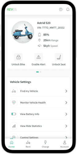
The home screen provided quick access to key features like renting scooters, finding charging stations, and managing accounts, with a dynamic layout that adapted once a vehicle was connected.
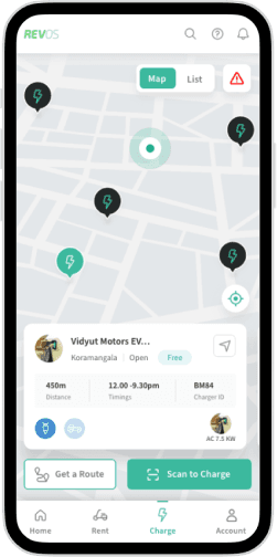
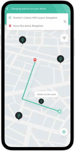
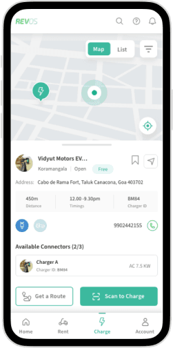
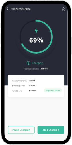
The app featured a map of nearby charging stations with detailed information on availability and charging rates, designed for user convenience.
Finding Charging Stations
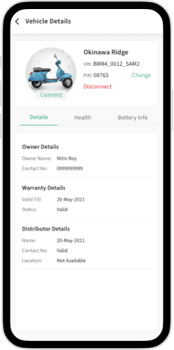
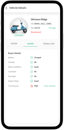
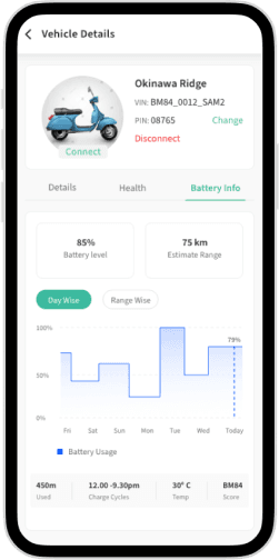
Detailed information on vehicle health and battery status was presented in a clear, concise manner, enabling users to manage their vehicle efficiently.
Vehicle Details, Health & Battery Info
Comprehensive UI Design
The app included over 150 screens, each carefully designed to ensure a consistent and intuitive user experience throughout.
Testing & Validation
Usability Testing:
Multiple rounds of usability tests were conducted with 20 users to identify and resolve potential issues. Feedback sessions helped refine the app’s design and functionality.
Iterative Feedback Loop:
Changes were made based on user feedback, followed by a second round of testing to validate these changes. Beta user feedback sessions provided insights on the app's overall design, functionality, and user experience.
Results
Improved ease of use and reliability
Higher user satisfaction with transparent pricing and straightforward billing
Enhanced navigation and search functionality


Challenges & Conclusion
Challenges
Balancing the need for a seamless and intuitive user experience with the complex functionality required to manage scooter rentals and payments. Ensuring accessibility for users with varying levels of technical proficiency and mobility was also crucial.

Conclusion
Creating a user-centered design for the Revos mobile app was challenging but rewarding. Extensive user research and iterative testing enabled the creation of a product that met user needs and expectations. The design process ensured a seamless and enjoyable user experience, with attention to detail in color palette and typography to communicate the brand's identity. Confidence is high that the Revos mobile app will be successful in the marketplace and improve the lives of its users.

Home
Thank you :)
Key Takeaways:
Project overview
In the bustling cityscape where mobility options were plenty but efficiency was scarce, Revos emerged as a promising solution for urban commuters seeking eco-friendly and convenient transportation. Revos, a smart electric vehicle (EV) sharing and renting service, faced a challenge: its mobile app was struggling to meet user expectations, leading to frustration and reduced engagement. Tasked with the mission to revamp this app, the journey began to transform Revos into a seamless and user-friendly experience that would not only retain its users but also attract new ones.
The Challenge
Problem Statement
Revos, an innovative scooter sharing and renting service, was facing a significant obstacle. Despite its potential, the existing mobile app was riddled with usability issues and inconsistencies that were deterring users from fully embracing the service. The challenge was to redesign the app to enhance the user experience, ensuring that it was intuitive, engaging, and aligned with user needs and expectations.
Goals
Redesign Goals
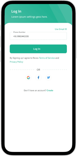
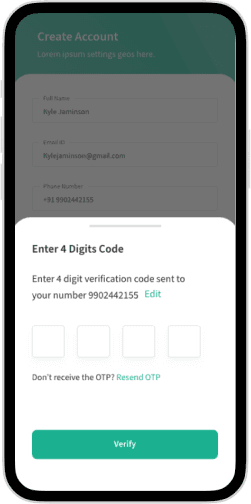
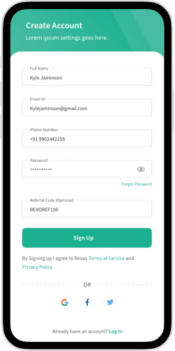
Simplify the registration process
Enhance scooter availability information
Improve navigation and search functionality
Streamline payment and billing features
Elevate the overall user experience and look and feel while maintaining brand identity


Research Analysis
User Research:
To truly understand the pain points and desires of Revos users, an in-depth research phase was initiated. This phase involved:
User Interviews
Gathering firsthand accounts of user experiences and frustrations.
Surveys
Collecting quantitative data to identify common trends and issues.
Usability Tests
Observing real users interact with the current app to pinpoint usability challenges.


User Survey Results:


85% of respondents reported difficulty finding available scooters quickly and easily.
60% found the registration process too complicated.
70% of respondents expressed a desire for more transparent pricing information and a straightforward billing process.
Key Research Questions
What challenges were faced while using the Revos app?
How easy or difficult was it to find and reserve a scooter?
What features were missing from the app?
What were the opinions on the current pricing and billing system?


Insights
Users valued clear and transparent pricing information and a straightforward billing process.
Users reported difficulty in finding and reserving available scooters quickly and easily.
Users found the registration process too complicated.
Users suggested improvements to the app's navigation and interface for better usability.


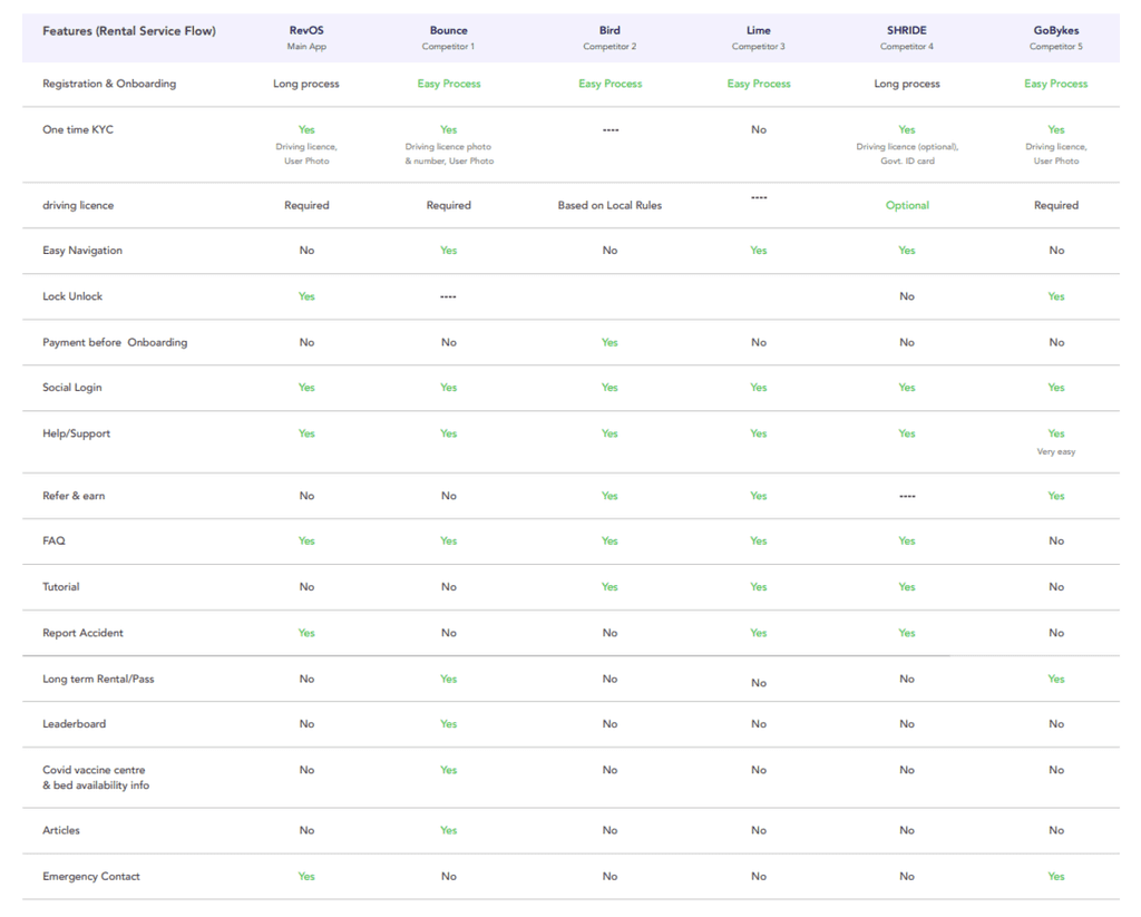
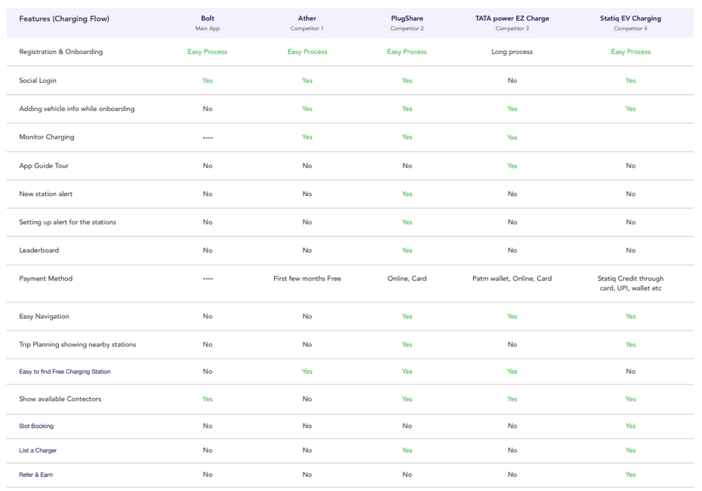
Competitor Analysis:
Key competitors were analyzed to understand their strengths and weaknesses. This involved studying their pricing models, user experiences, app functionalities, and marketing strategies. Insights gained from this analysis informed design decisions, allowing for innovation and addressing gaps in the market.

Design Thinking Process
Empathize:
Engagement with users through interviews and surveys helped understand their pain points, needs, and behaviors.
Define:
Research findings were synthesized to define key problems:
Complex registration process
Difficulty in finding available scooters
Lack of transparent pricing and billing information
Inefficient navigation and search functionality


Ideate:
Brainstorming sessions led to numerous ideas and potential solutions. Mind mapping and affinity diagrams were used to organize thoughts and prioritize features.
Prototype:
Low-fidelity wireframes visualized the app structure, and high-fidelity mockups refined the visual design. The prototyping phase included multiple iterations based on feedback.
Test:
Usability tests were conducted with prototypes to gather user feedback. Iterative improvements ensured the design met user needs.
Design Process
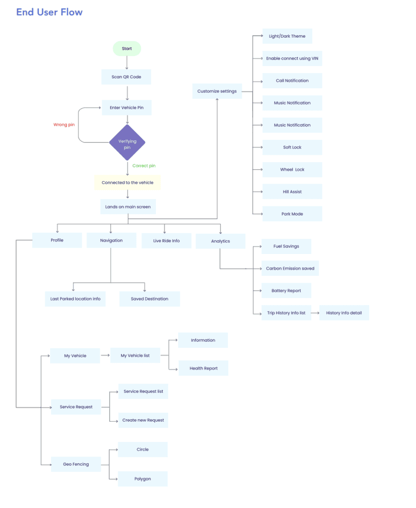
User Flow:
An optimized user flow was mapped out, ensuring a seamless experience from registration to scooter rental and charging station location.
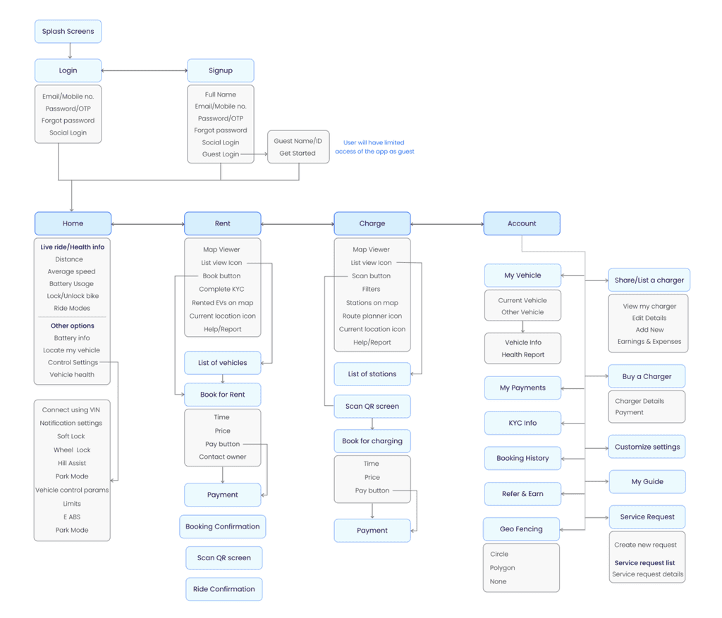
Information Architecture:
The app's information architecture was restructured to enhance navigation and accessibility, making it intuitive for users to find what they need.
Engaging and informative onboarding screens were designed to explain the app's functionality and benefits, helping users get started quickly.
Onboarding
Key Screens & Features
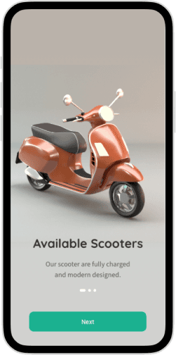
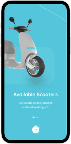
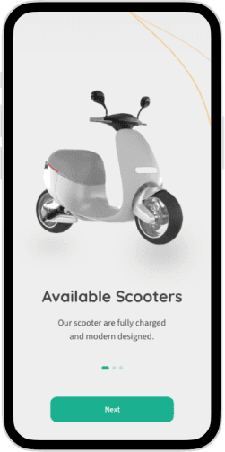
We designed onboarding screens that provided a clear explanation of the app's functionality and features, as well as how users could benefit from using the app. These screens were designed to be engaging and informative, helping users get started with the app quickly and easily.
Login, Create Account & OTP
Style Guide:
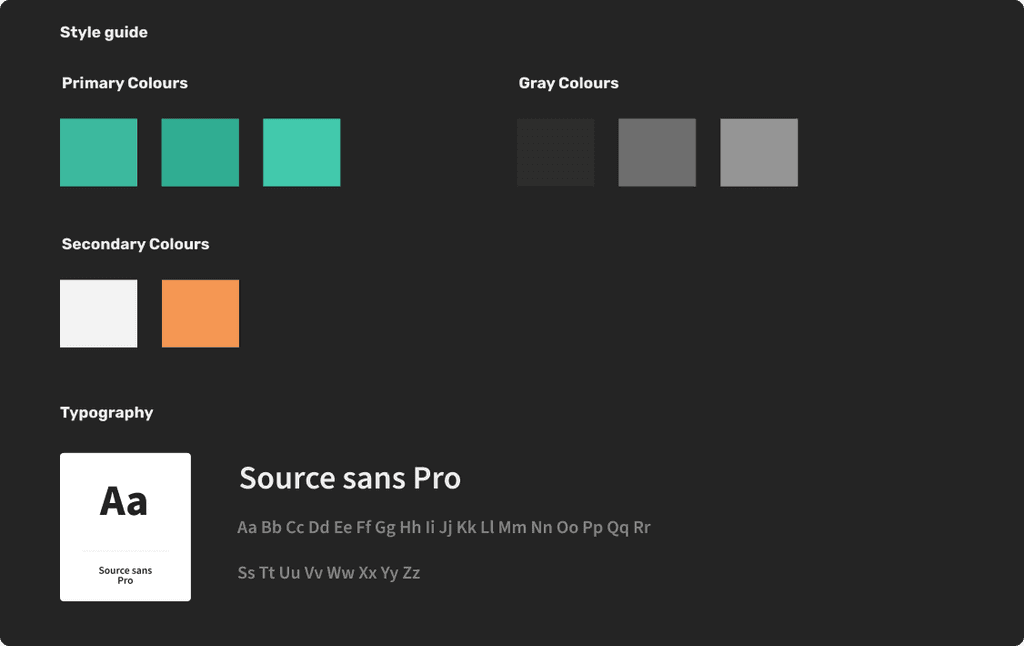
A cohesive design system was created with a consistent color palette, typography, and UI elements to maintain brand identity and ensure a unified user experience.
