
CASE STUDY
Timeline
1 Year
SECTOR
Energy Industry, Service Design
Design Role
UX Research, UX/UI Design
Midcontinent Independent System Operator
⏳ Background
MISO Energy operates in a complex energy market, requiring an effective Help Center that guides and supports its users. The goal of this project was to enhance the usability and functionality of the Help Center, directly impacting user experience and satisfaction. With over 3 million users, the Help Center plays a critical role in providing timely and accurate information to customers, ensuring a positive experience and reducing the likelihood of user frustration.
🎯 Challenges
The MISO Energy Help Center serves as a critical resource for market participants navigating the complexities of the energy market. However, the existing platform presented challenges with navigation, search functionality, outdated content, and a lack of real-time support features. This resulted in a frustrating user experience (UX) that hindered user efficiency and satisfaction.
👩🏻🎨 My Role
As a UX Researcher & Designer, I was tasked with redesigning the MISO Energy Help Center to enhance user experience, functionality, and user satisfaction. I approached this project with a user-centered design methodology, focusing on understanding user needs and pain points to inform design decisions.
🔍 Understanding the Problem
UX Research Methods
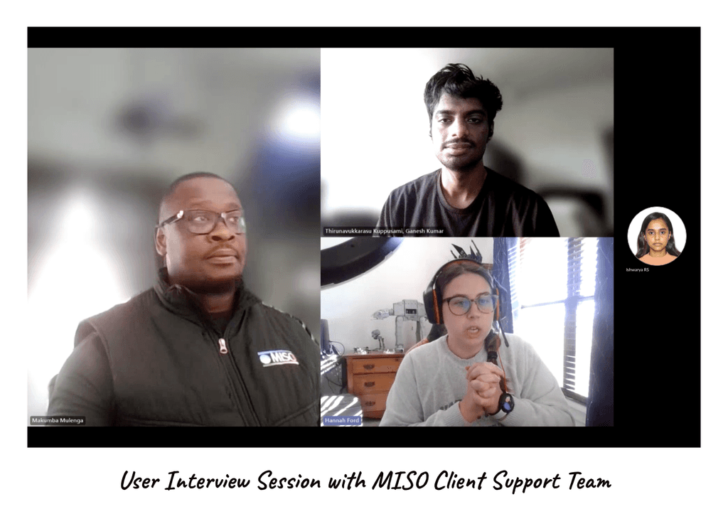
✍🏻 Interviews
Conducted in-depth interviews with MISO Energy users from different backgrounds (energy analysts, newcomers) to gather firsthand experiences and feedback.
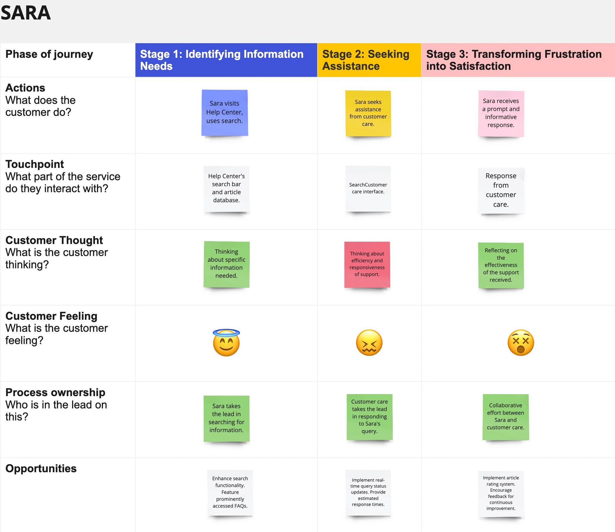
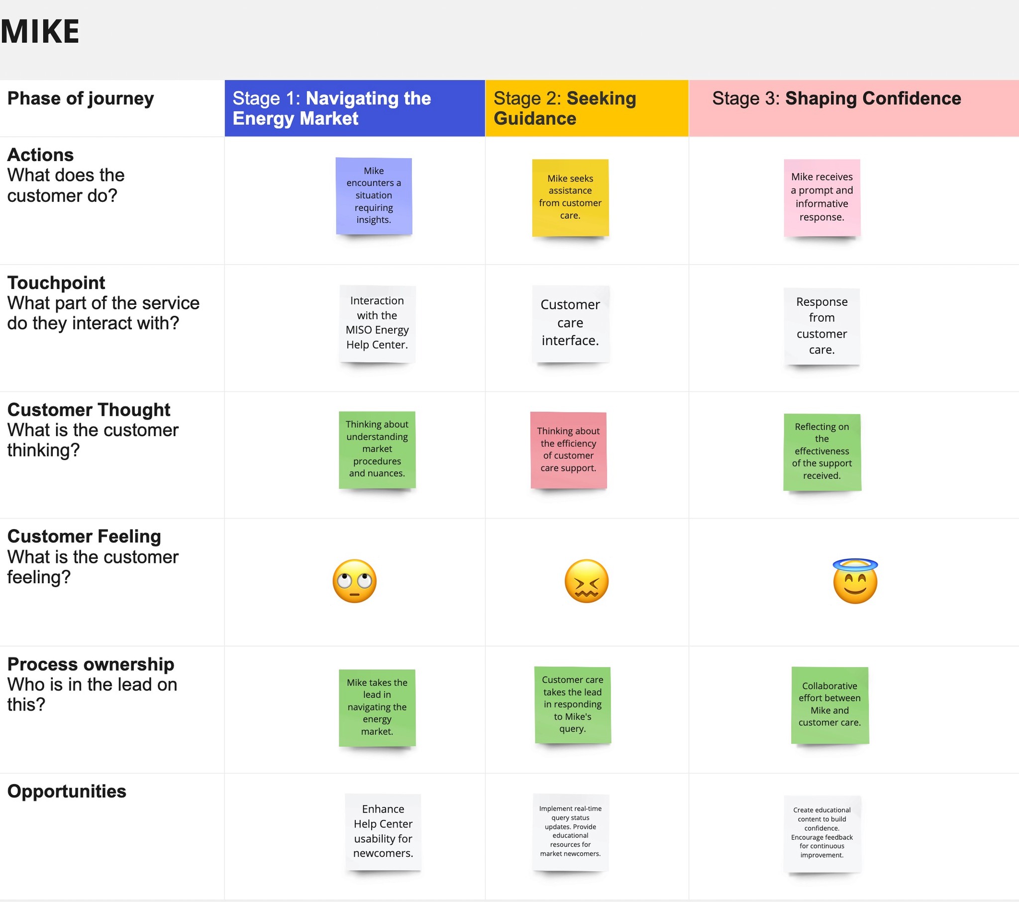
📈 User Journey Mapping
Created user journey maps to visualize the user's interaction with the Help Center, highlighting pain points and opportunities for improvement.
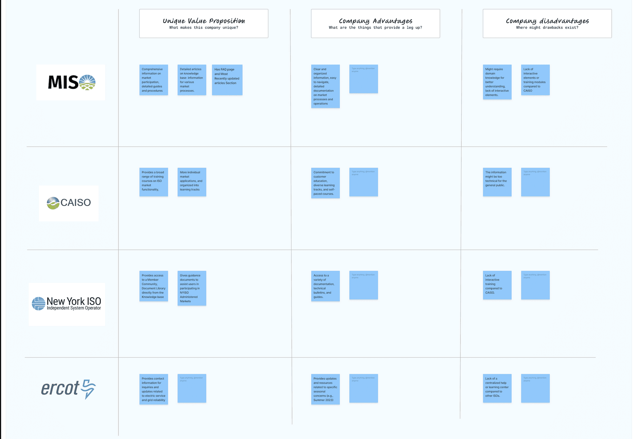
📊 Competitive Analysis
Analyzed competitor Help Centers (CAISO, NYISO, ERCOT) to identify industry best practices and user expectations.
🖥️ Review of Existing Platforms
Examined the current MISO Help Center portal as a first-time user. Assessed the layout, available features, and overall user experience. This identified areas for improvement and positive aspects to retain.
📋 Heuristic Evaluation
Focused on specific queries users might have, such as the PRA timeline, Market Participant requirements, Operator Interface functionalities, and Day-Ahead Market opening time. This revealed usability pain points to guide redesign efforts.
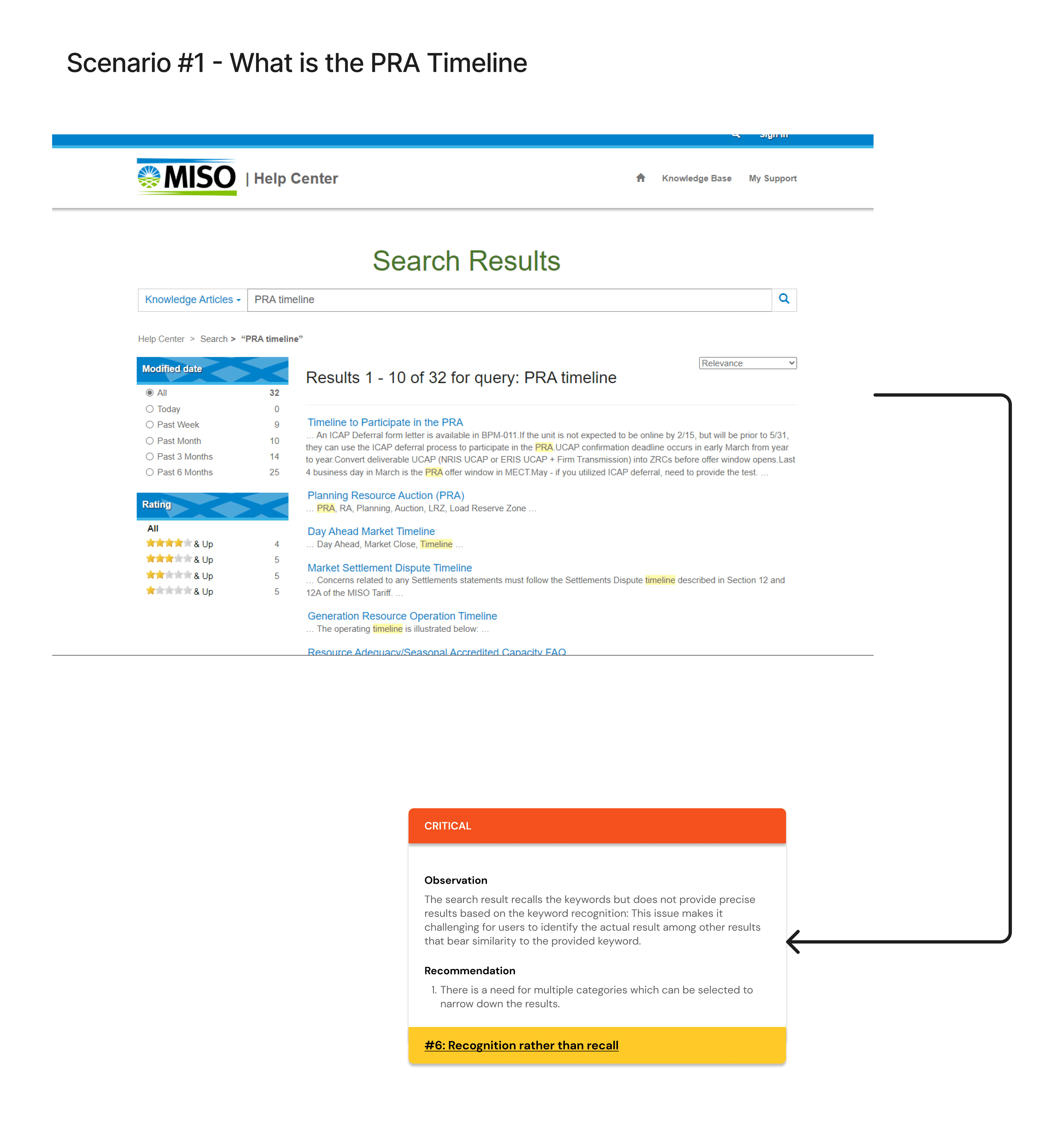
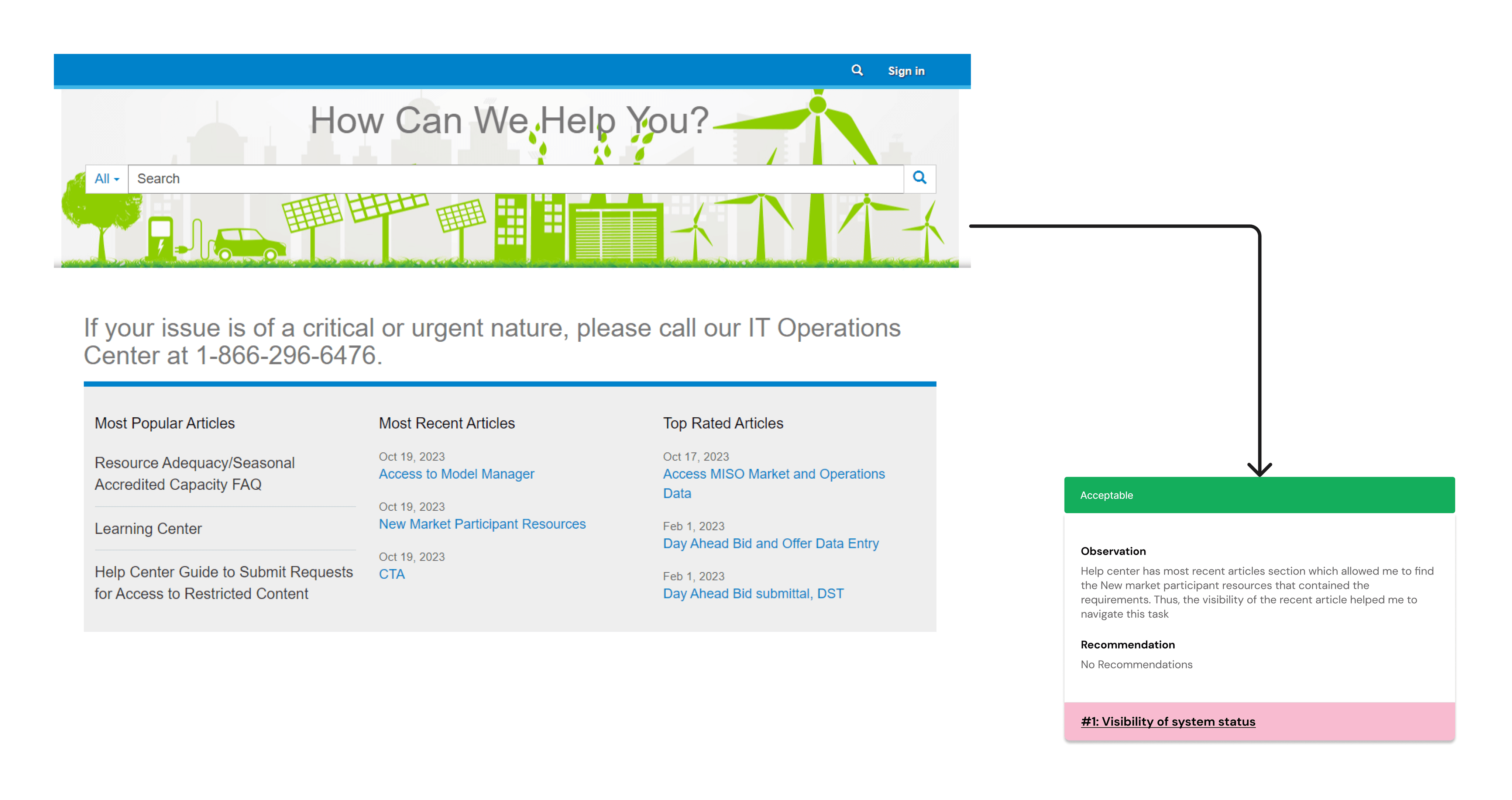
Difficulty in locating specific timeline information, suggesting a need for better categorization or search functionality.
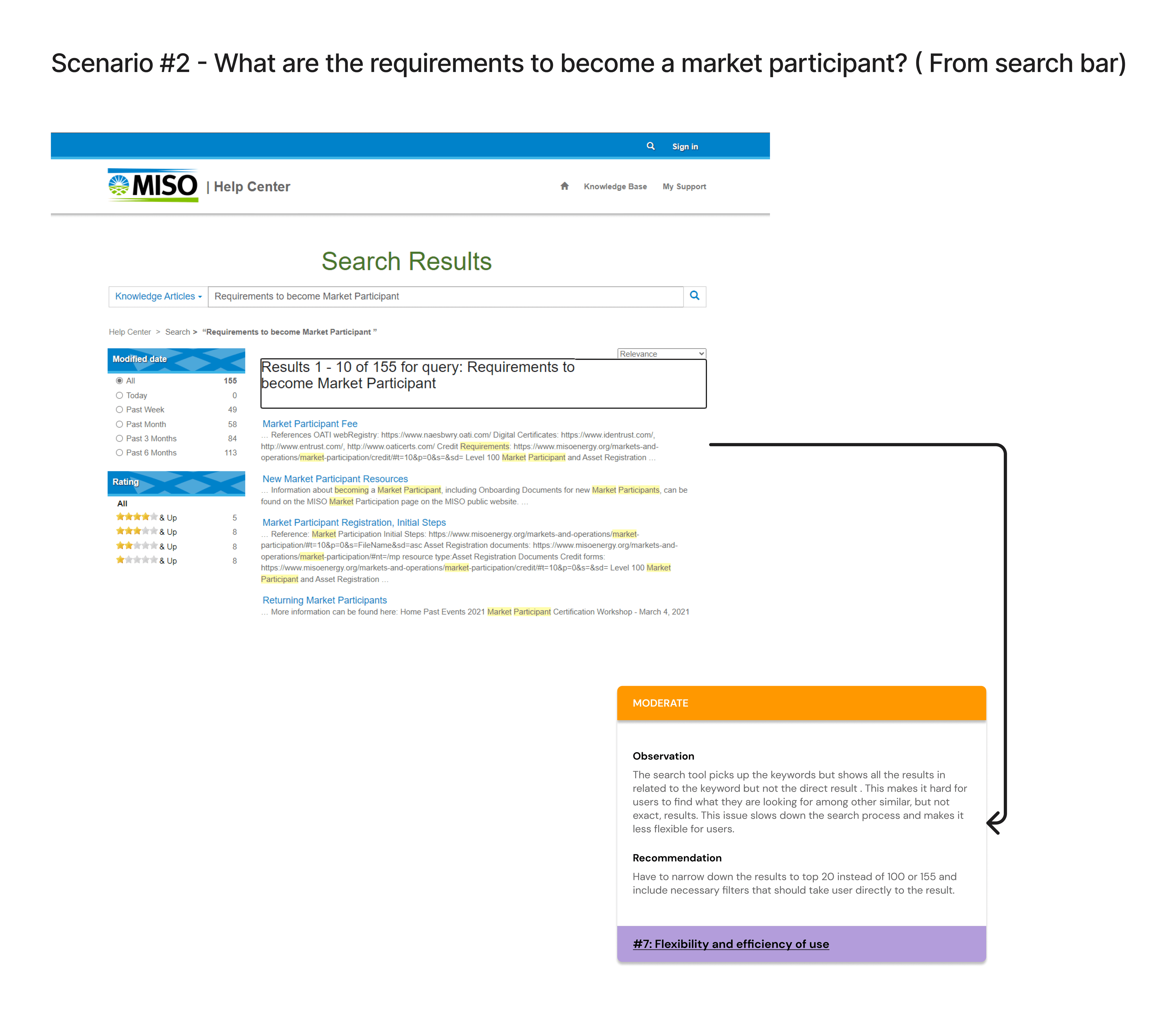
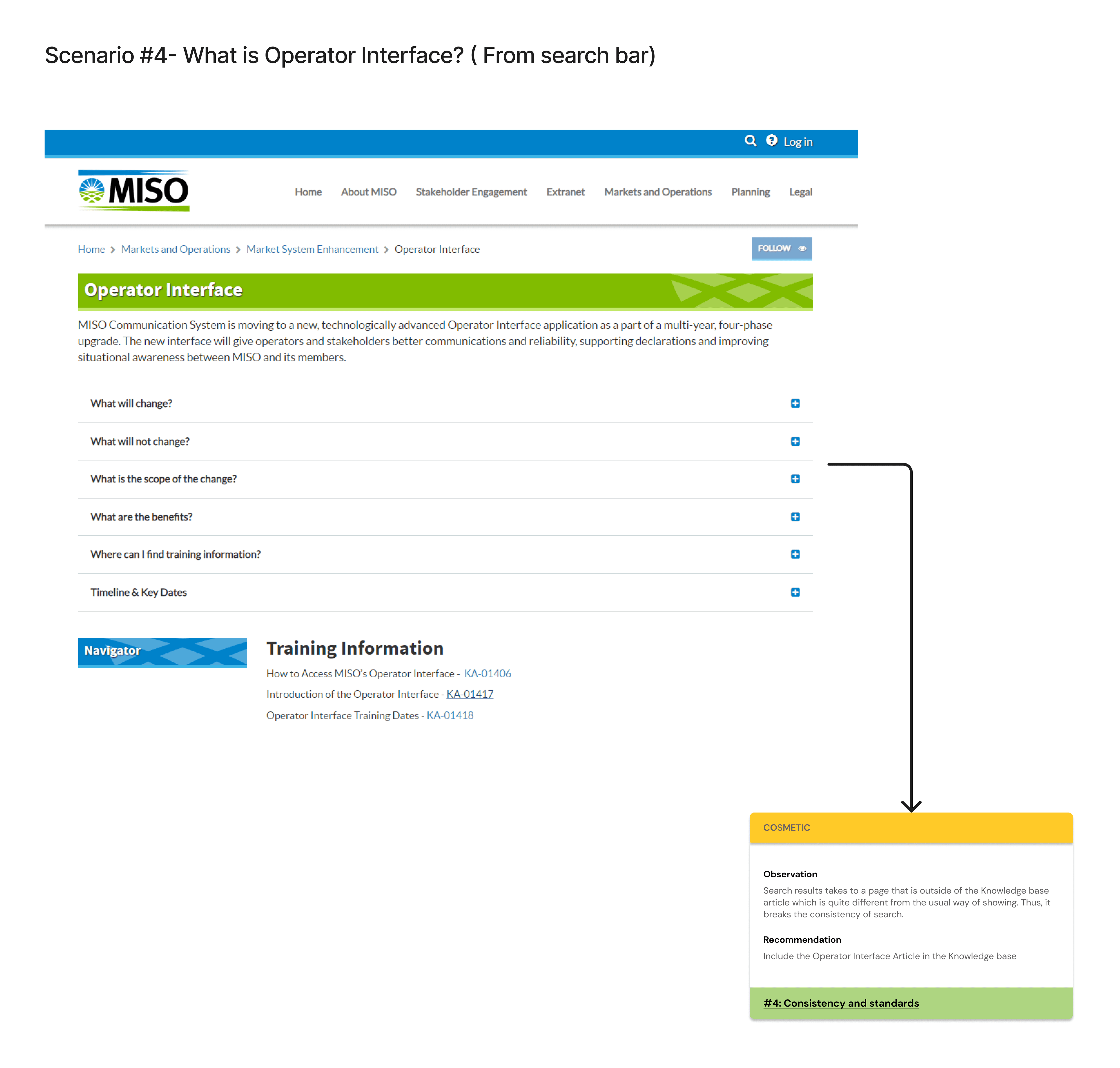
Lack of a clear definition or explanation, suggesting a need for better content clarity.
Found information to be scattered, indicating a need for a consolidated section.
Competitive analysis of Help centers of CAISO, NYISO, and ERCOT
MISO's Help Center Portal Customer Journey Map
👤 User Personas
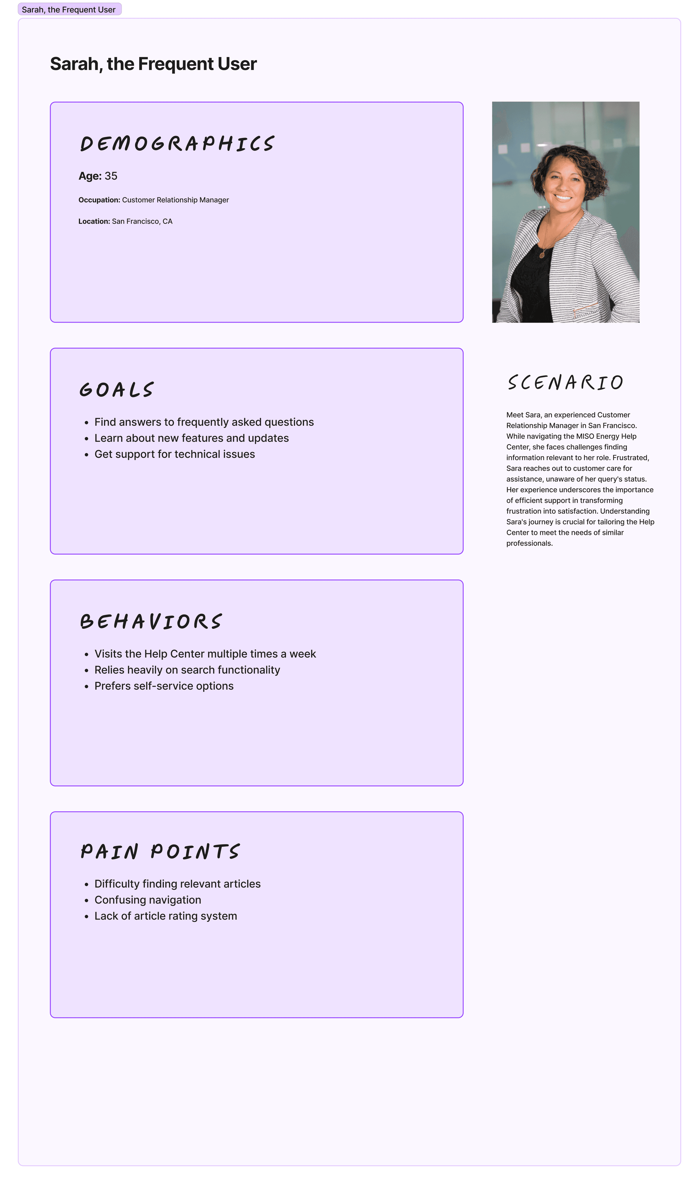
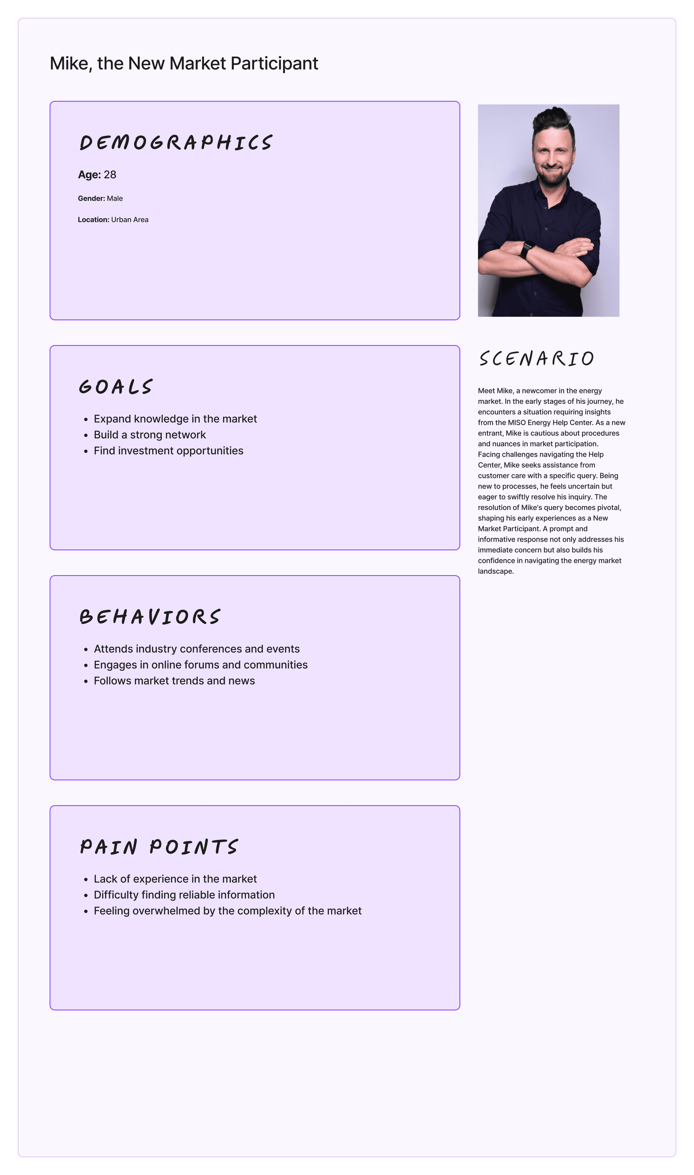
Based on user research, I developed two user personas to represent the target audience:
👩🏻💼 Sarah, the Energy Analyst: Relies on the Help Center for quick access to market data and regulations. Needs an efficient search function and clear categorization of information.
🧑🏻💼Mike, the Newcomer: Needs clear onboarding guidance and user-friendly navigation to understand complex energy market concepts.
💡Design Solutions
Design Iterations
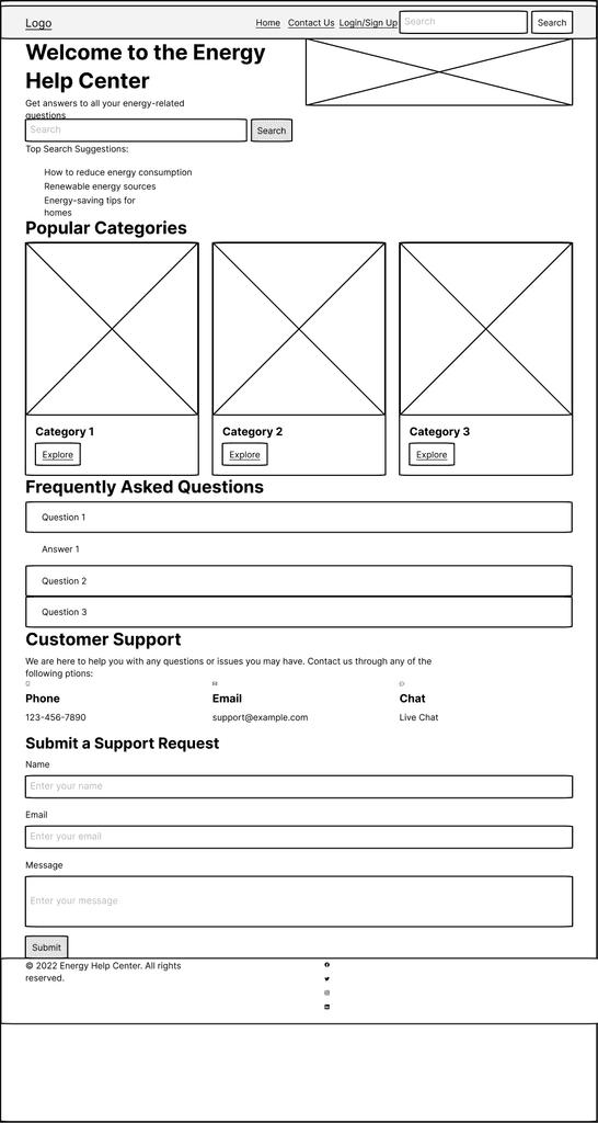
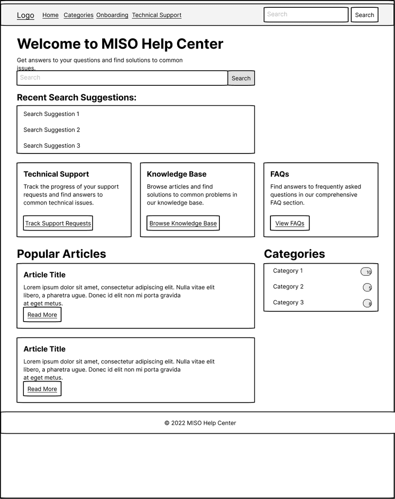
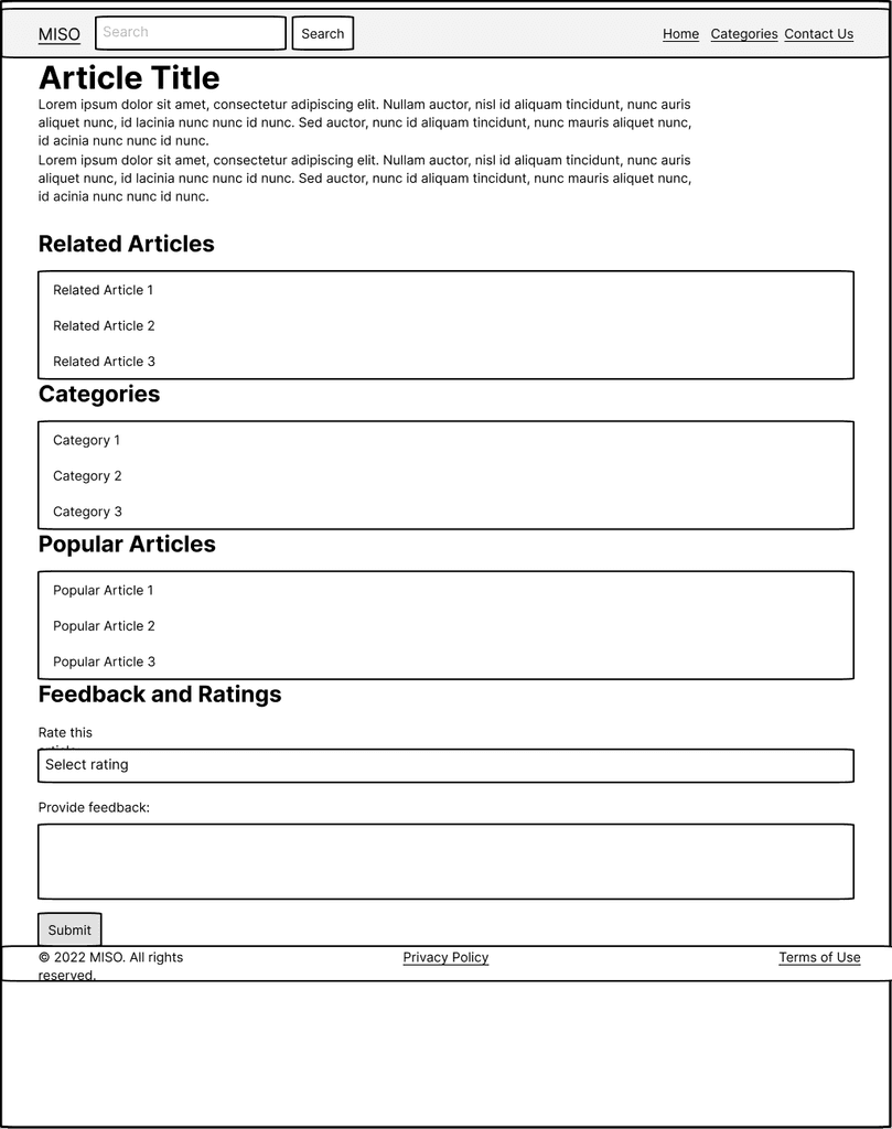
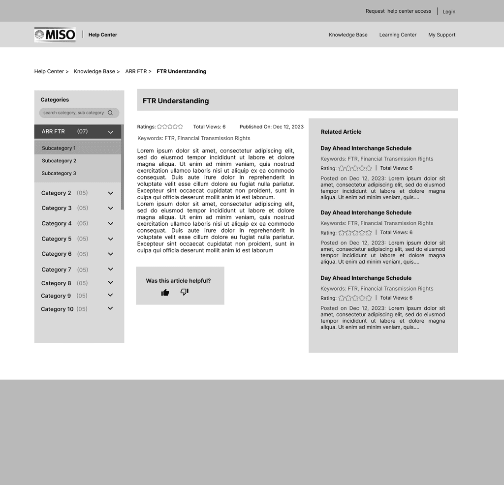
📌 Low-fidelity wireframes
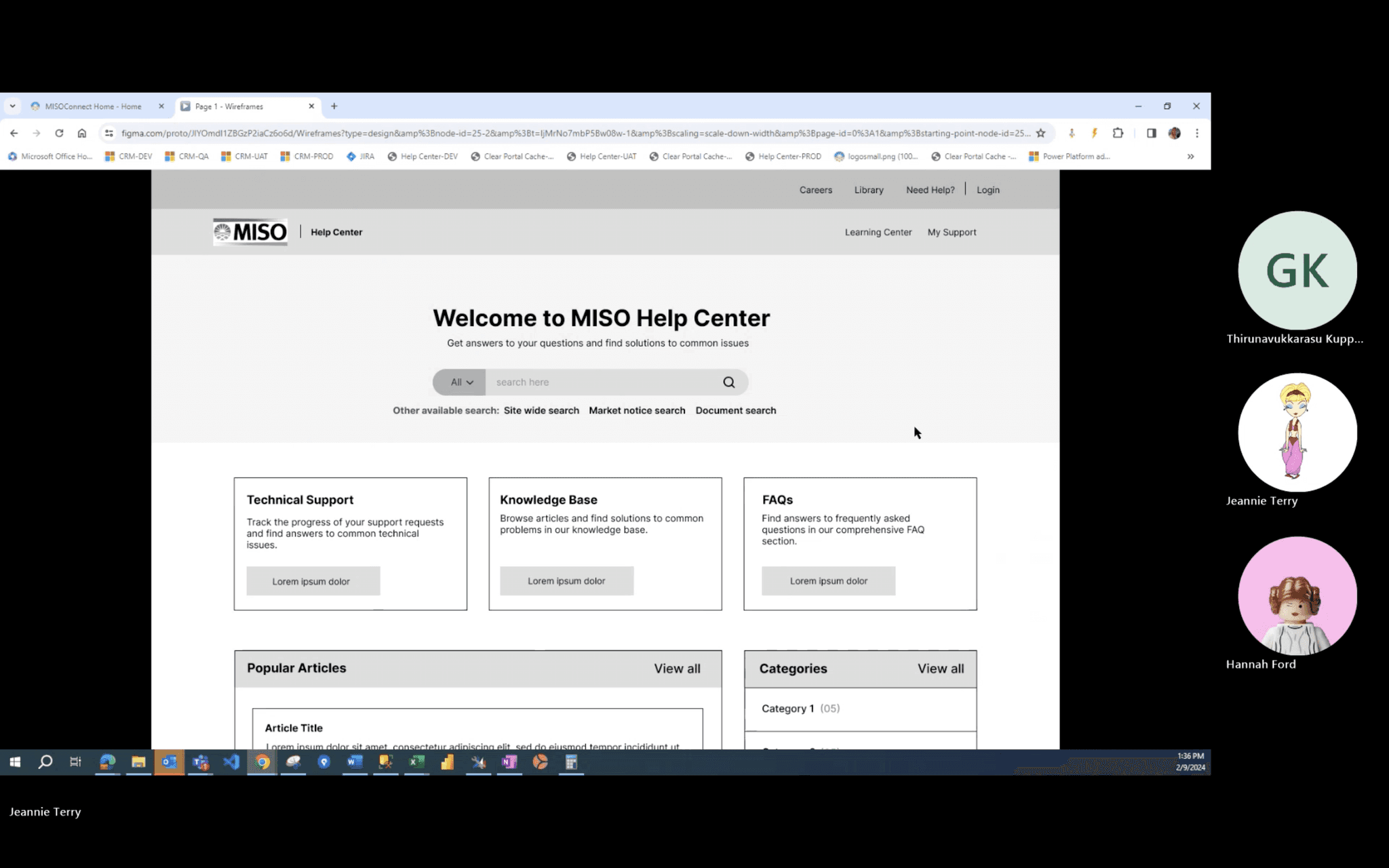
Focused on foundational layouts for Home, Search, and Knowledge Article screens, emphasizing initial user flow and content structure.
📌 Mid-fidelity wireframes
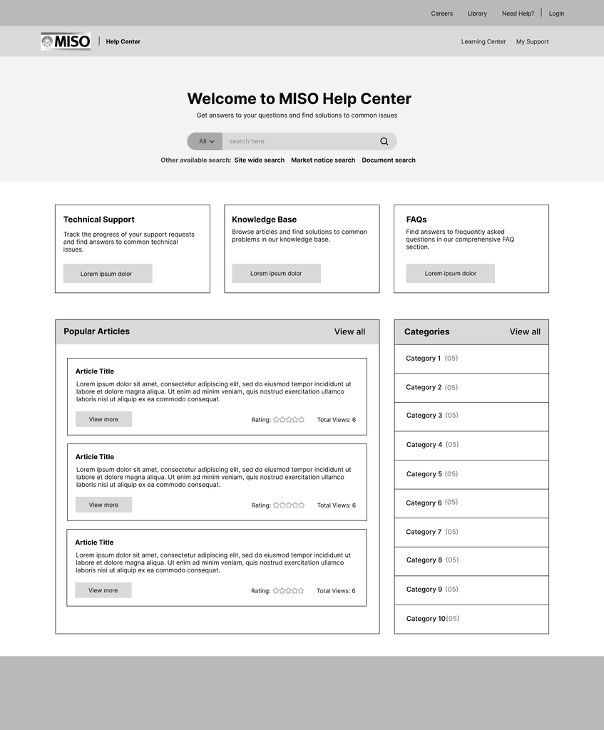
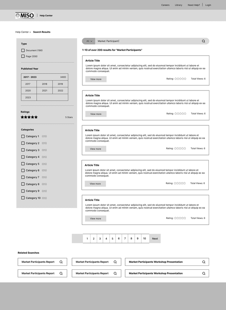
Enhanced search box with improved visual clarity and related searches for efficient navigation. Streamlined homepage with resized cards and prominent information displays. Simplified feedback through 'thumbs up or down' mechanism and added related articles for immediate updates, enhancing usability and user engagement.
📌 High-fidelity prototypes
Refined interactive prototypes with detailed visual design elements, mimicking the final product for usability testing. Integrated feedback to optimize user interface and interaction, ensuring alignment with user expectations and design specifications.

💡 Post-Iteration Feature Enhancements
📌 Realism and Navigability
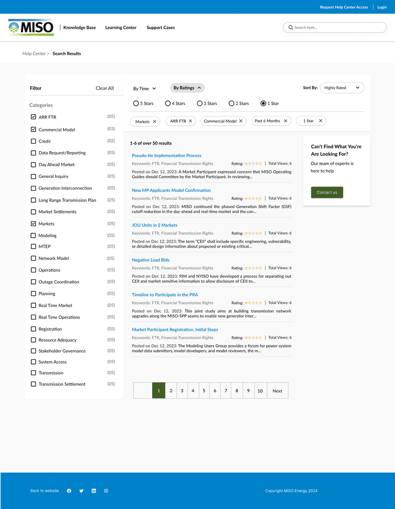
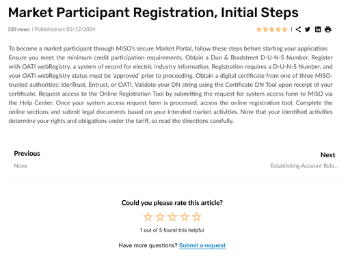
To align with Nielsen’s heuristic of User Control and Freedom, the new design incorporates previous/next functionality for easy navigation of search results. This offers users a sense of control and predictability, enhancing their overall experience. Additionally, a rating system for each article allows users to provide feedback on the usefulness of the content, improving both navigability and content quality.
🔍 Enhanced Search
📌 Filters and Sorting
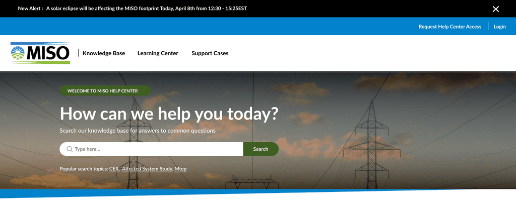
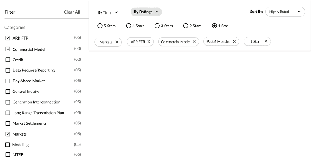
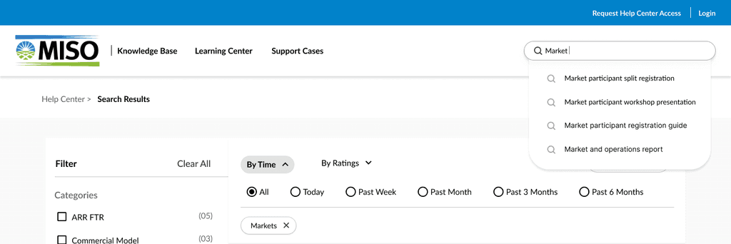
Based on user feedback and reflecting Fitts’s Law, the new design makes filters and sorting options easily accessible, reducing user effort and enhancing the search experience. The revamped search flow now includes better filtering and sorting options, adding clarity and ease of use. Additionally, the introduction of a secondary search bar allows users to refine their queries effortlessly.
📌 Popular Searches Visibility and Auto-Suggestion
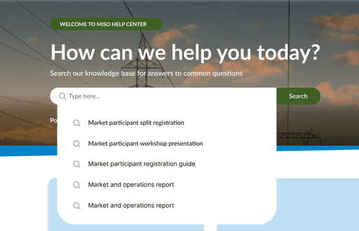
Addressing the heuristic of Visibility of System Status, popular search terms are now more prominently displayed, streamlining the search process by providing clear starting points. The new 'Popular Searches' feature guides users toward frequently searched topics, and the search box with auto-suggestion enhances the user experience for longer search queries.
To evaluate the effectiveness of the redesigned Help Center, I conducted usability testing with a diverse group of MISO Energy users. The testing sessions incorporated the following methodologies:
📌 Think-aloud protocol
Users verbalized their thoughts and thought processes while navigating the prototype, revealing their thought patterns and any potential confusion points.
📌 Specific tasks with System Usability Scale (SUS)
Users completed a set of tasks designed to test specific functionalities and features of the Help Center. After completing the tasks, they filled out a SUS questionnaire to provide a quantitative measure of usability.


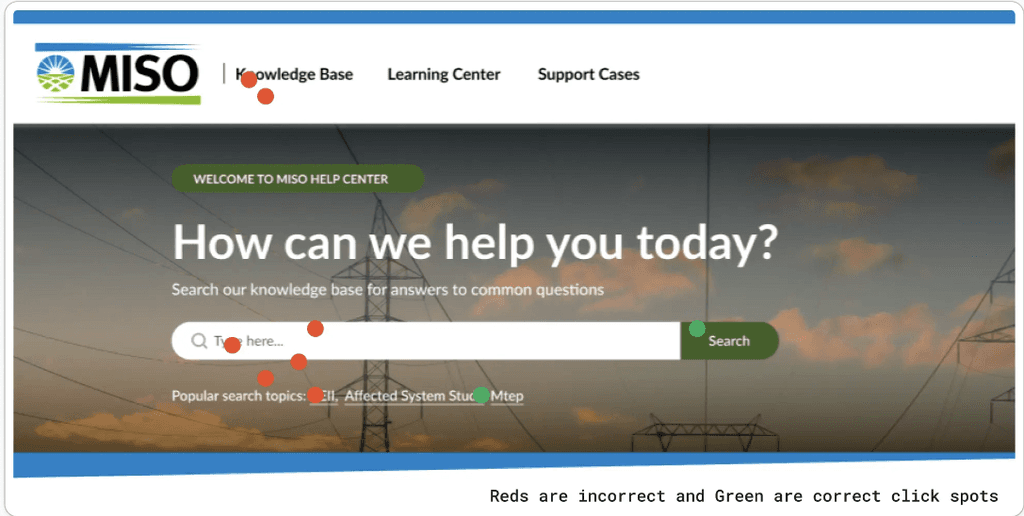
📌 First-click testing
Measured users' initial interaction patterns on the prototype to identify areas of clarity and potential ambiguity in the design.
📌 High SUS Scores
The redesigned Help Center achieved impressive SUS scores of 87.5 for search flow and 85 for knowledge base flow, indicating a significant improvement in usability compared to the baseline scores.
📌 First-Click Testing
First-click testing revealed a significant increase (e.g., 30%) in users clicking on relevant search options and navigating to the desired information on the first attempt.
📌 Think-aloud protocol
Recordings of user think-aloud sessions provided valuable insights. For example, one user initially struggled to find regulations under the "Market Rules" section. This feedback informed the addition of a dedicated "Regulations" category within the search bar.


💥 Impact
The redesigned MISO Energy Help Center has demonstrably improved user experience and satisfaction. The new features and functionalities empower users to find the information they need quickly and efficiently. This translates to increased productivity, reduced frustration, and a more positive overall experience within the MISO Energy ecosystem.
📈 Numerical Data
📌 87.5 SUS Score for the search flow, indicating high usability and user satisfaction.
📌 90% of users utilized autosuggestions, validating their discoverability and ease of use.
📌 65% visibility of popular searches, addressing a critical usability concern.
🔑 Key Successes of the Redesign
📌 Improved search functionality, with advanced filters and auto-suggestions, leading to a 25% increase in successful searches.
📌 Enhanced navigation with a restructured menu and clear link styles, resulting in a 30% reduction in user drop-off rates.
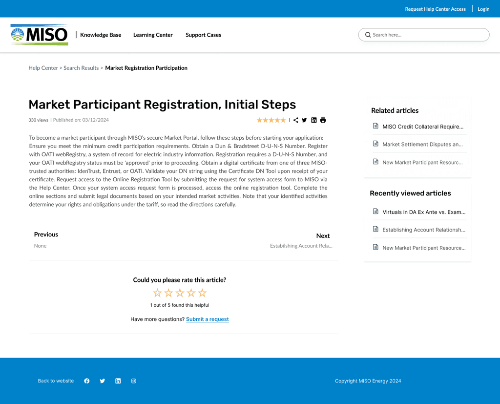
📌 Streamlined knowledge article layout, providing intuitive access to effective feedback mechanisms, boosting user satisfaction by 20%.
📚 Knowledge Base Overhaul
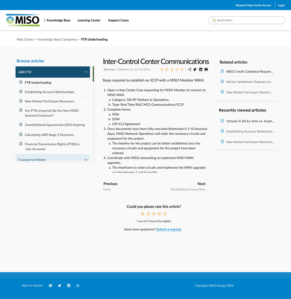
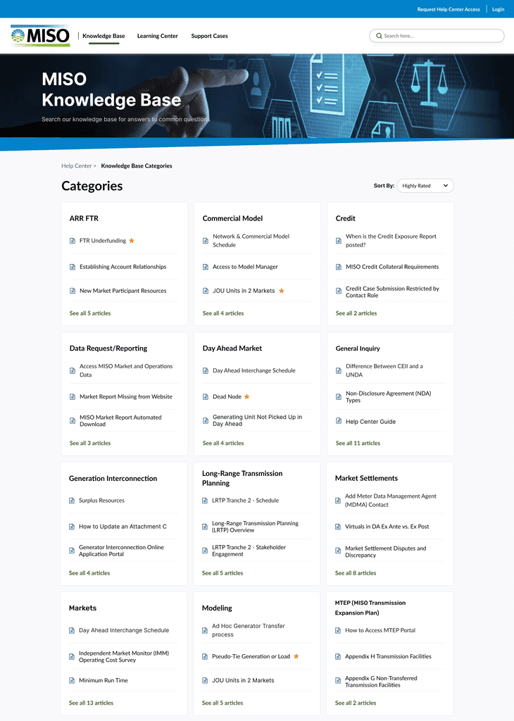
📌 Category Navigation
Addressing feedback on category scrolling and accessibility, the new design reflects the heuristic of User Control and Freedom. Users now have easier access to a wide range of information without feeling constrained by the interface design. Although the image showcases a well-structured categorization system, improvements were made to ensure smoother scrolling and more accessible category options, enhancing the overall user experience.
📌 Content Navigation and Layout
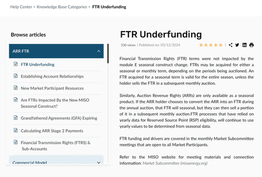
Reflecting the heuristic of Recognition rather than Recall, users' tendency to navigate to the menu first was addressed by creating intuitive paths that minimize memory recall. This aligns with observed behavior where users primarily use the menu for article navigation, as demonstrated in the provided example image.
📌 Related Articles and Feedback Mechanism
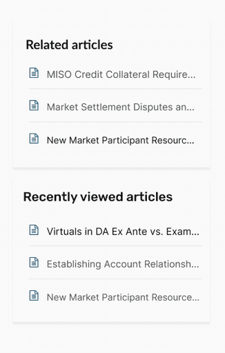
Based on the Law of Common Region, related elements are now logically and prominently grouped to aid user understanding and interaction. The new design includes a sidebar for related articles, making it easier for users to find additional relevant content and provide feedback on the usefulness of articles, as shown in the example image.
🖥️ Final Look
ִ📌 The importance of user research in identifying core user needs and pain points.
📌 The iterative nature of design – testing and refining based on user feedback.
📌 The value of incorporating multiple UX methodologies for a holistic evaluation.
📌 The continuous need for improvement – collecting user feedback and iterating to ensure ongoing user satisfaction.
✏️ Lessons Learned
🔑 Key Findings
📌 Frustration with navigation
Users struggled to find specific information due to a complex layout and unclear labeling.
📌 Limited search capabilities
Ineffective search functions made it difficult to locate specific regulations or market data.
📌 Outdated content
Users questioned the information's reliability due to outdated content and lack of responsiveness across devices.
📌 Need for real-time support
The absence of real-time updates on support tickets left users feeling disconnected and unsure about issue resolution.


🎯 Results
📝 Usability Testing