
Detailed CASE STUDY
Timeline
1 Year
SECTOR
Energy Industry, Service Design
Design Role
UX Research, UX/UI Design
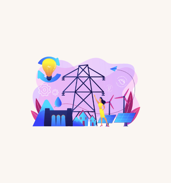
Midcontinent Independent System Operator

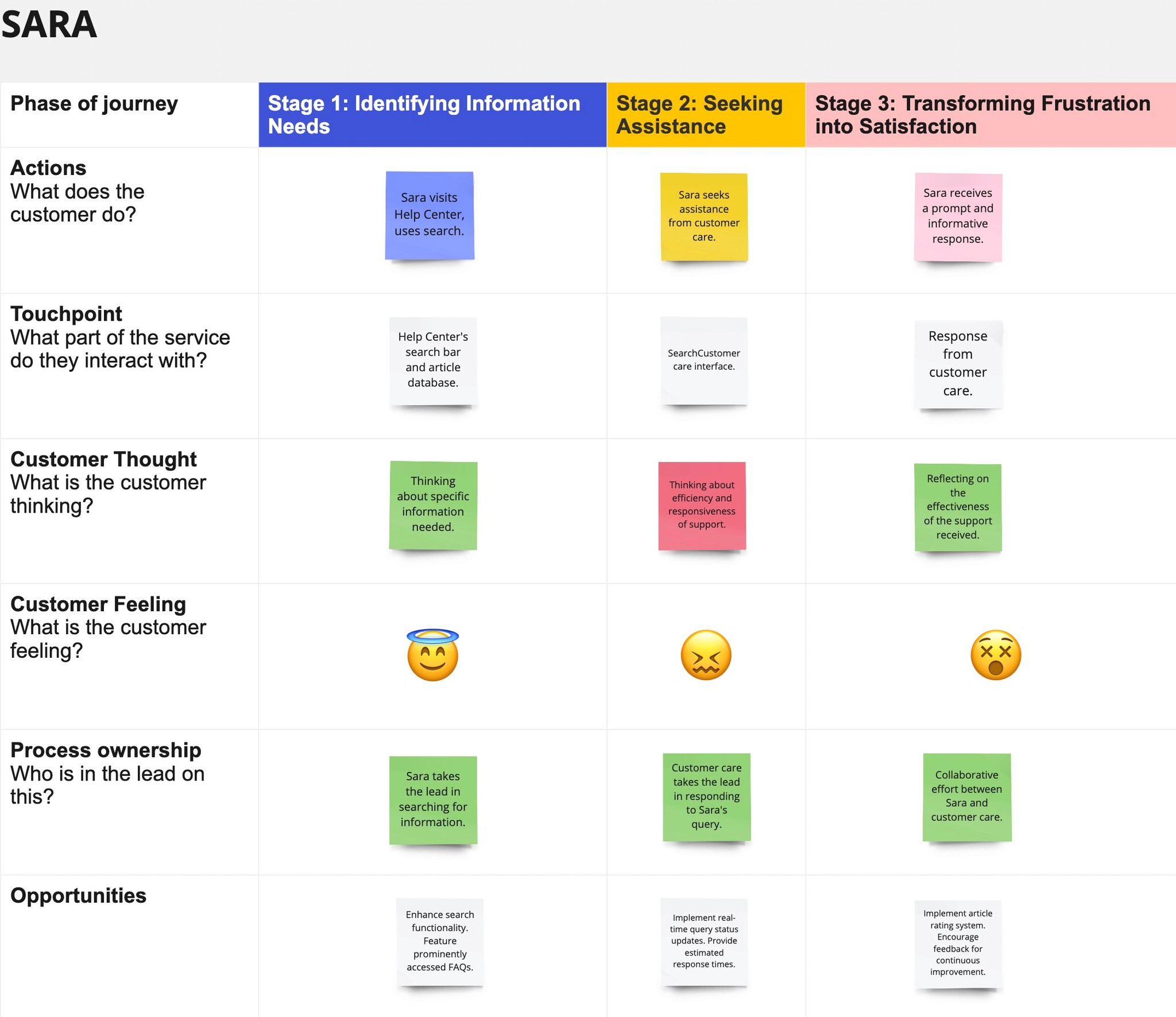
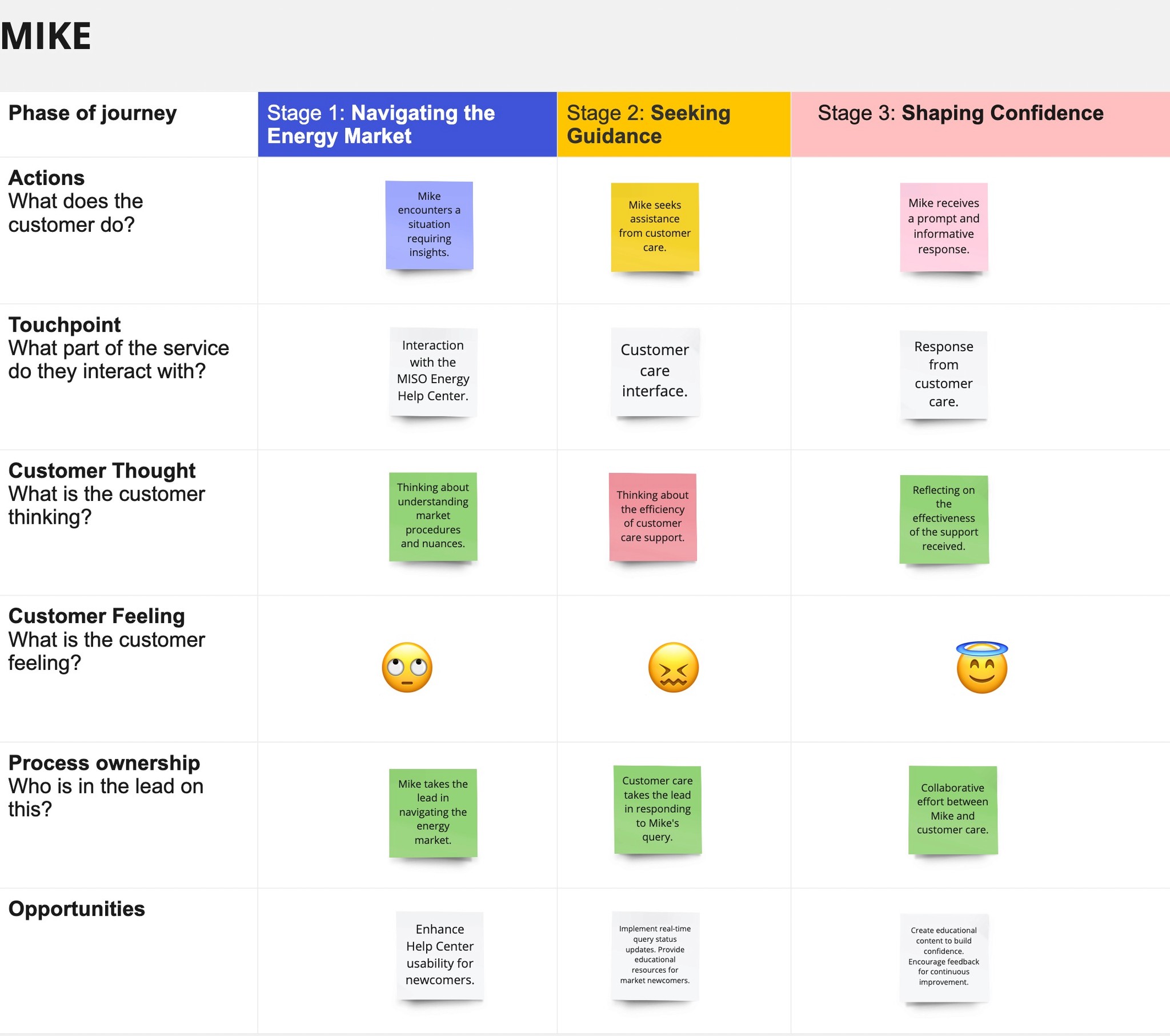
The user journey map is a visual representation of a typical user's experience with the MISO Help Center. It highlights various stages of interaction, from initial contact to resolution, emphasizing both pain points and areas of satisfaction. This map is based on insights gathered from user interviews and analysis.
User Journey Mapping
Ease of Navigation:
Users struggle with inconsistent navigation and inadequate backlinks, leading to confusion.
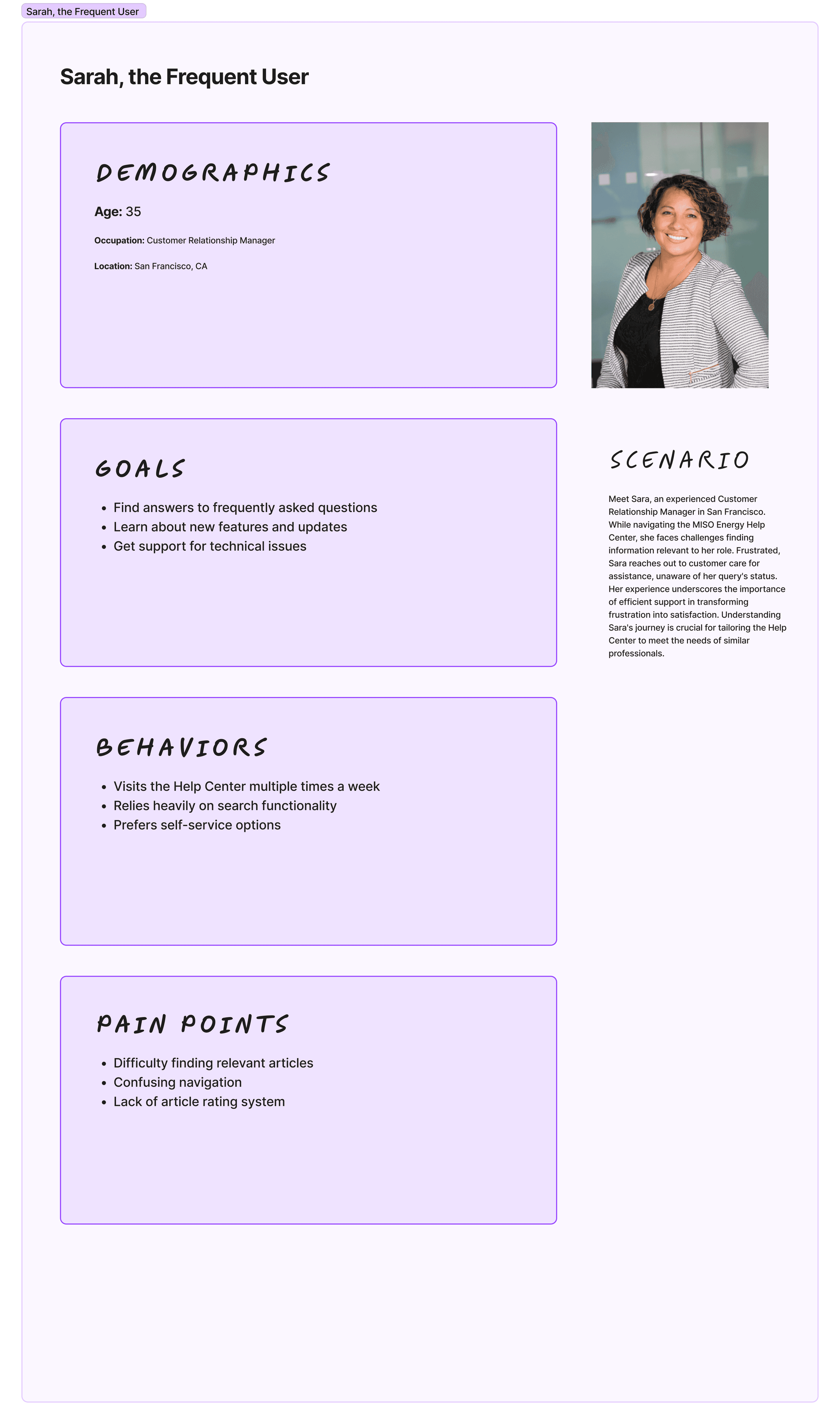
Sarah, an energy analyst, faced challenges finding vital market data due to confusing menus.
Discoverability of Knowledge Articles:
Users encounter difficulties due to unclear categorization and insufficient cross-linking.
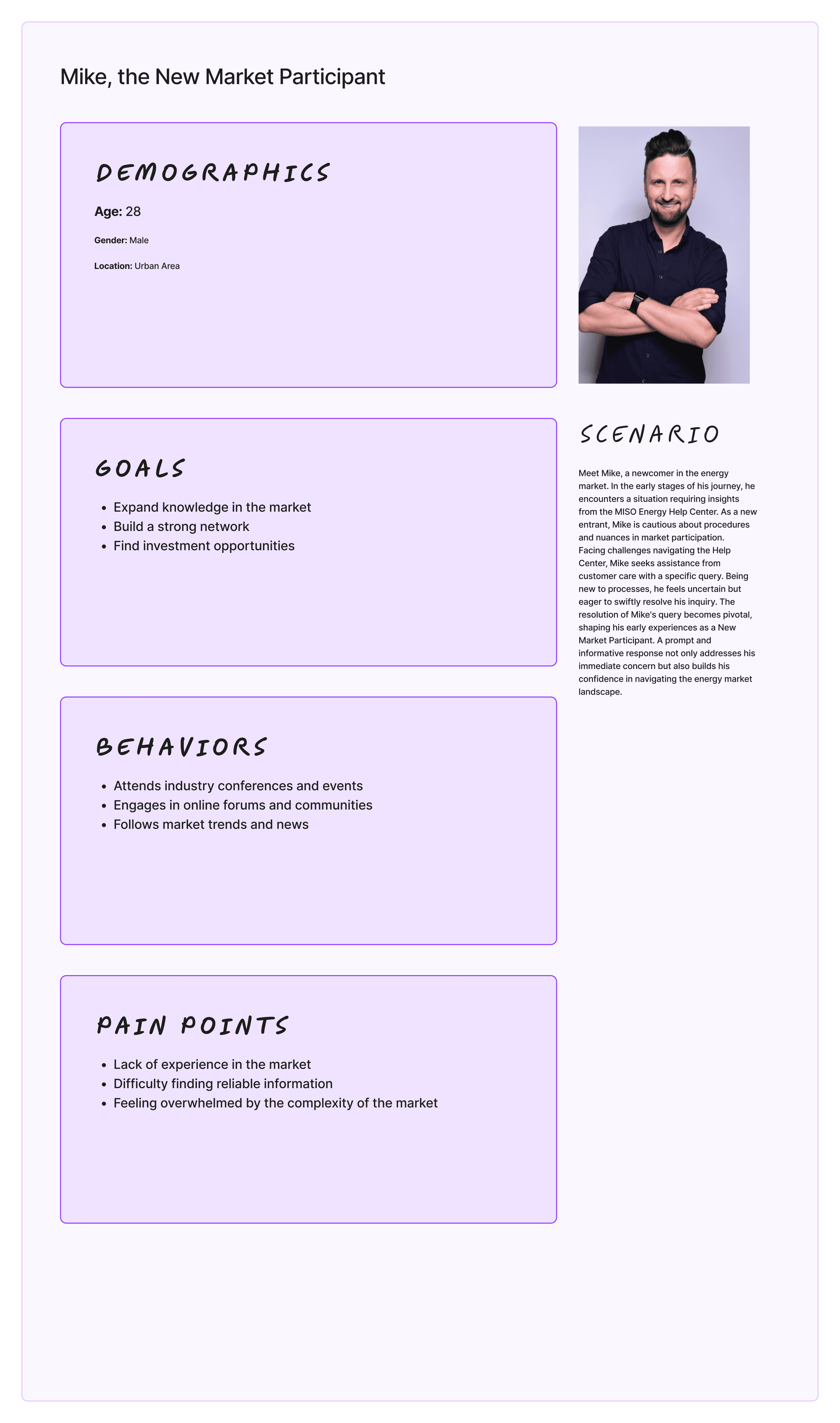
Mike, a newcomer, felt overwhelmed by disorganized articles, hindering comprehension.
Lack of Real-time Support Ticket Status:
Users feel disconnected due to ineffective knowledge article layout and difficulty accessing FAQs.
Sarah, an Operations manager, experienced issues accessing operator procedures FAQs, impacting decision-making.
Key Insights from Affinity Mapping & User Journey Mapping:

Persona
Key Takeaways:
Review of Existing Platforms
Examined the current MISO Help Center portal.
Assessed layout, features, and user experience as first-time users.
Identified areas for improvement and positive aspects to retain.
Heuristic Evaluation
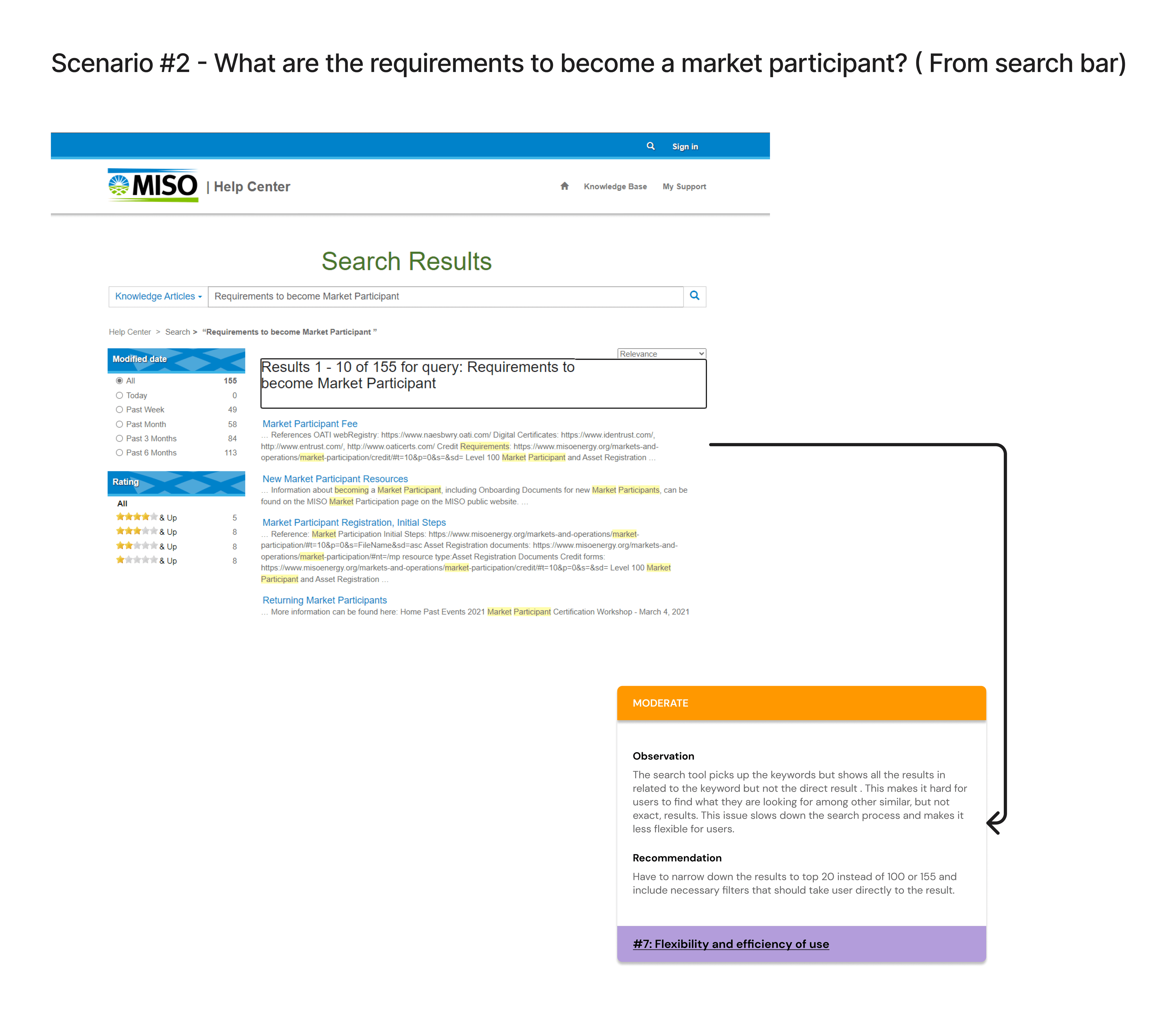
Focused on specific queries such as the PRA timeline, Market Participant requirements, Operator Interface, and Day-Ahead Market opening time.
Revealed pain points to guide redesign efforts.
Competitive Analysis
Assessed competitors' Help Center portals for layout, support channels, and self-help resources.
Provided insights into industry best practices and user expectations.
Literature Review
Explored articles and resources from the MISO Learning Center.
Highlighted the importance of user-centered design and improved navigation.
Provided a foundation for integrating learning modules and help resources in the redesign strategy.
Project overview
MISO Energy operates in a complex energy market, necessitating a Help Center that effectively guides and supports its users. This project aimed to enhance the usability and functionality of the Help Center, directly impacting user experience and satisfaction.
Our Capstone project focuses on the comprehensive redesign of the MISO Help Center portal. This effort aims to enhance user experience, functionality, and aesthetics to better align with MISO Energy's objectives.
Introduction
Background Research
Takeaways from Heuristic Evaluation
Scenario Based Findings
Project Goals & Objectives
The overarching goal of the MISO Energy Help Center Redesign Project is to revitalize the existing platform into a more intuitive, efficient, and user-friendly resource. To achieve this, our objectives were meticulously crafted, focusing on identifying and resolving user pain points, developing a set of initial redesign requirements, and fostering a collaborative relationship with the client to ensure alignment with their vision.
Objectives
Identify pain points and challenges faced by Help Center Portal users.
Propose design solutions to improve navigation, article discoverability, and technical aspects.
Establish initial requirements for application development.
These goals guide our efforts to create a Help Center that not only addresses current issues but also sets a new standard for user experience in the energy sector.
Methodology
Our methodology for understanding the MISO Energy Help Center user experience began with desk research, analyzing literature, competitive analyses, and best practices. We conducted user interviews to gather qualitative insights and used affinity mapping to identify patterns and pain points. Finally, user journey mapping visually highlighted key interaction points and pain areas, ensuring our redesign is based on real user experiences.
In our initial background research phase, we have taken several key steps to gain a comprehensive understanding of the current state of the MISO Help Center portal. Here are the details of our research activities:
Ease of Navigation
Difficulty locating specific information like the PRA Timeline and Market Participant requirements indicates a need for improved navigation structure.
Search Functionality
Limited search capabilities hinder tasks such as identifying the Operator Interface and finding the day ahead market opening time, underscoring the importance of enhancing search functionality for a smoother user journey.
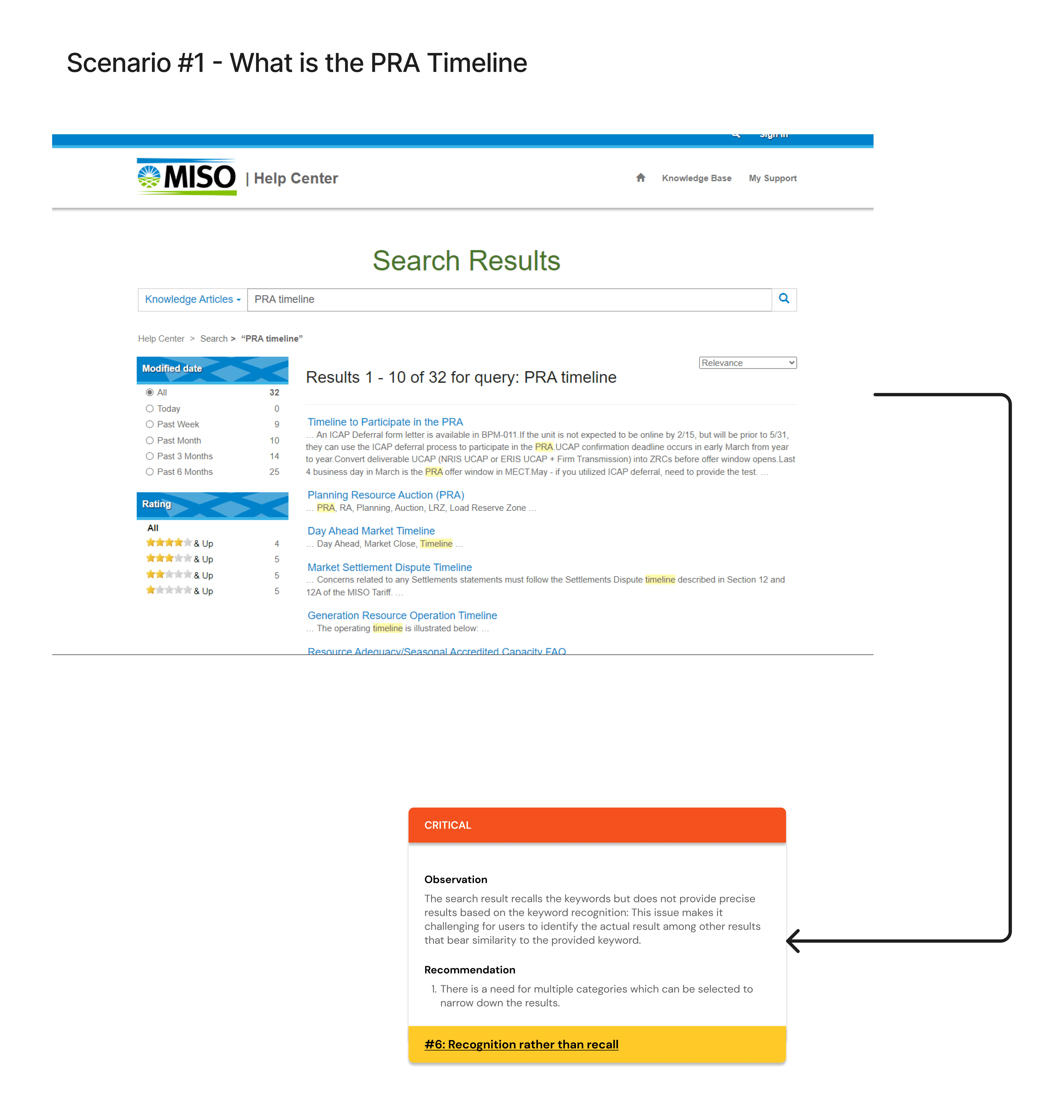
Difficulty in locating specific timeline information, suggesting a need for better categorization or search functionality.
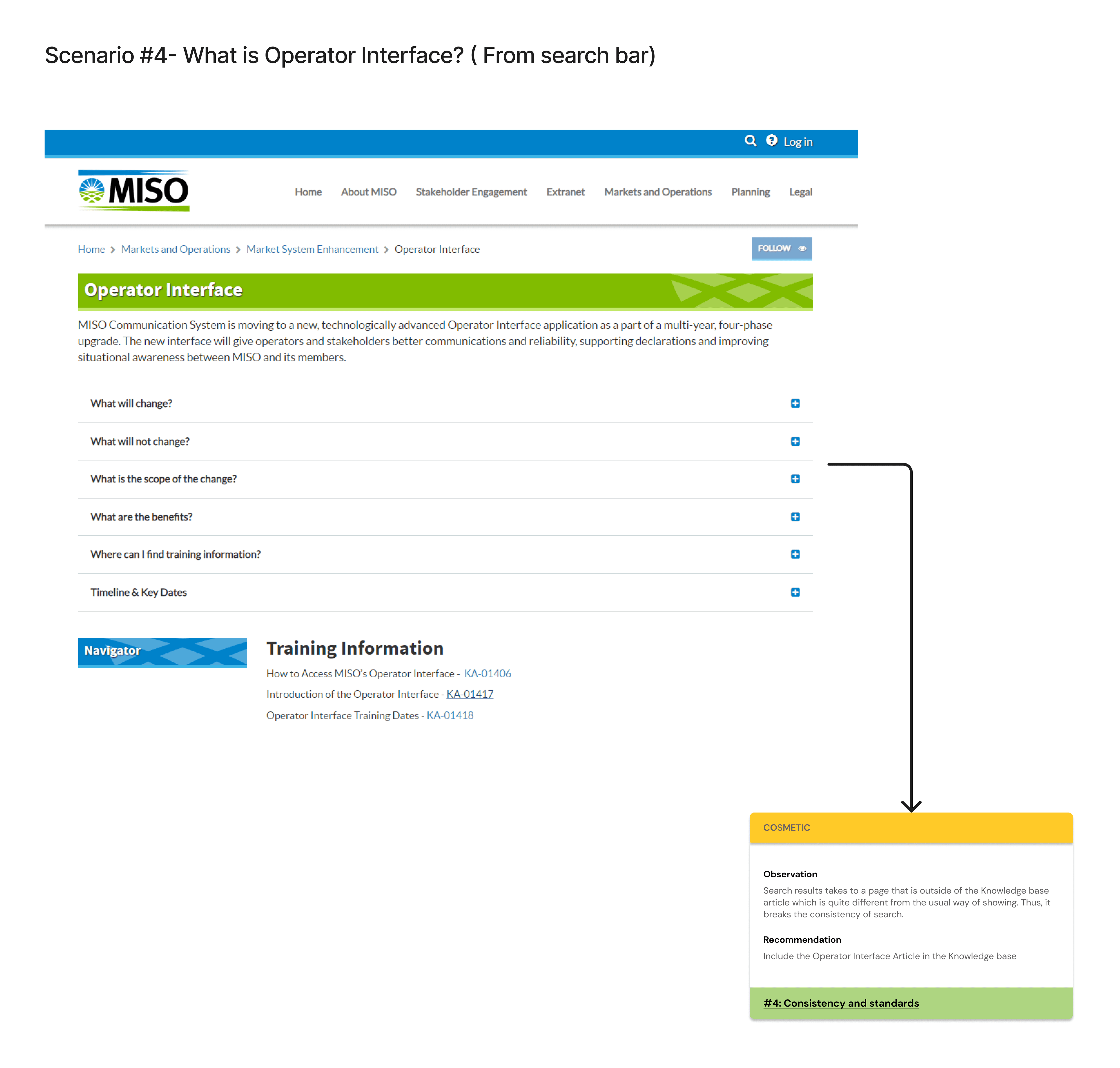

Found information to be scattered, indicating a need for a consolidated section.
Lack of a clear definition or explanation, suggesting a need for better content clarity.
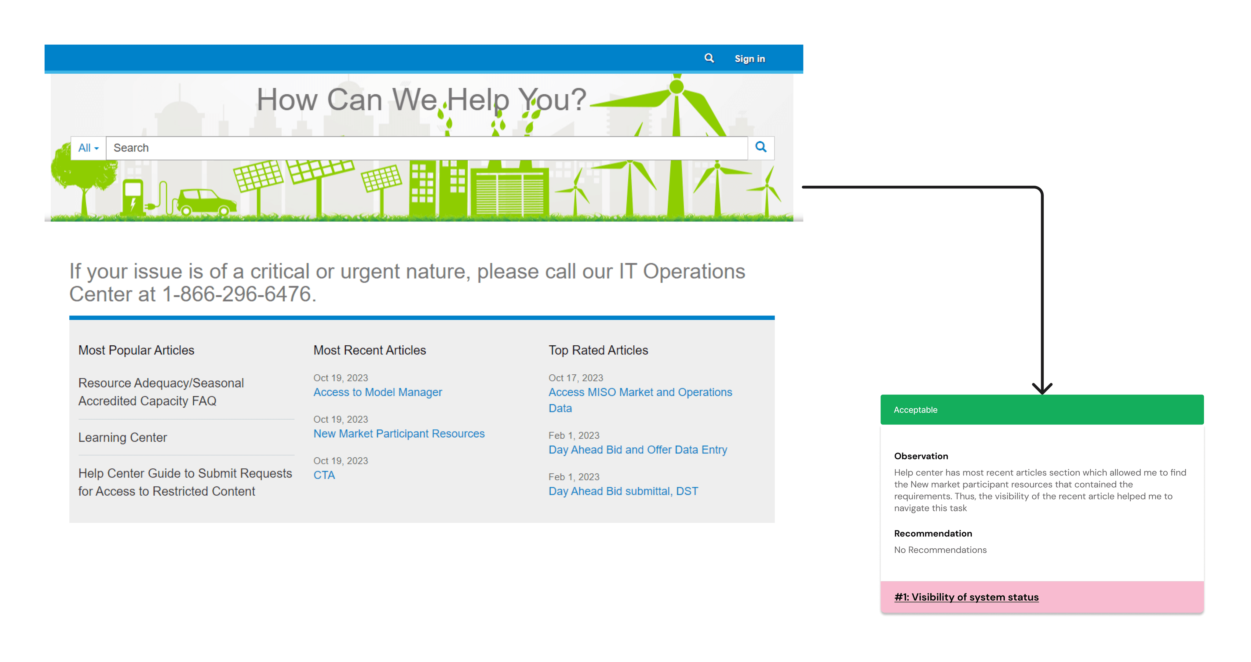
Information found was not easily noticeable, indicating a need for better visibility or highlighting.
Takeaways from Competitive Analysis
Desk Research
The competitive analysis entailed a detailed comparison of MISO's Help Center portal with those of CAISO, NYISO, and ERCOT, revealing a variety of design and organizational approaches.
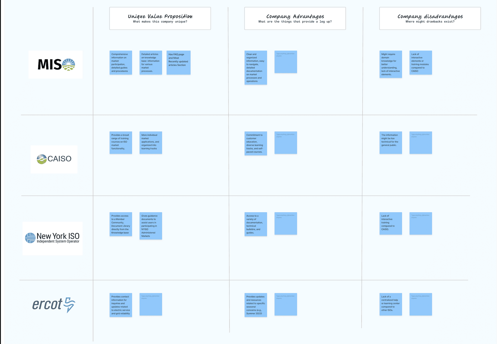
CAISO Help Center:
Relevance: Navigation and content organization insights inform MISO Help Center redesign.
Features: Intuitive navigation, detailed FAQ, robust search.
NYISO Help Center:
Relevance: Sets benchmark for content presentation in MISO Help Center.
Features: Clearly categorized info, easy-to-find contacts, resource-rich knowledge base.
ERCOT Help Center:
Relevance: Offers insights for enhancing MISO user experience.
Features: User-friendly interface, comprehensive FAQ, effective search.
Competitive Standing: MISO excels in content organization but can enhance engagement with interactive modules.
Community Interaction: Implementing a member community akin to NYISO fosters engagement and support.
Seasonal Updates: Emulating ERCOT's proactive updates ensures users stay informed.
Feedback Mechanism: Structured feedback loop drives continuous improvement aligned with user needs.
Key Takeaways:
User-Centric Design: Prioritizing user needs, pain points, and expectations is paramount.
Well-Organized Content: Clear structure facilitates efficient self-service and enhances user satisfaction.
Effective UI: Intuitive interfaces aid navigation and information retrieval for positive user experiences.
Rich Media Integration: Diverse content formats improve engagement and cater to varied learning preferences.
User-Driven Problem Solving: Direct user engagement informs tailored content and support solutions.
Key Takeaways:
Design Issues
Visual inconsistencies, particularly with the search box and category selection were prominent. These issues, along with the layout of knowledge articles and link styles, pointed to a fragmented user experience.
Functional Issues
The absence of real-time support ticket status for logged-in users emerged as a significant functional gap, impacting user satisfaction and efficiency.
Backend/Technical Issues
Limited visual cues for support query status and the lack of in-app notifications were identified as technical shortcomings that could hinder user engagement and awareness.
Key Insights:
We commenced a review of various publications on user-centered design approaches for Help Center portals.
1) For instance, the recent paper by Smith, J. (2020) on "Customer portal research and design | Proceedings of the 2003 conference on Designing for user experiences (acm.org)" emphasized the importance of intuitive navigation, clear content categorization, and effective search functionality.
2) Another paper by McKoen, P. (2000). on Creating a help center from scratch | Proceedings of the 28th annual ACM SIGUCCS conference on User services: Building the future emphasized the need for ongoing support & fine-tuning what has become a high standard for customer service and technical support.
User Interviews Transcript Analysis
User interviews were conducted to gather firsthand experiences and feedback on the Help Center. These interviews were then meticulously transcribed, and the transcripts were analyzed to identify recurring themes and pain points. Affinity mapping was employed to organize and prioritize these insights. This collaborative process involved grouping similar issues and observations to discern overarching themes.
These insights are critical in guiding the redesign of the Help Center. By addressing these design, functional, and technical issues, the project can significantly enhance user experience, ease of use, and overall satisfaction with the Help Center.
Relevance to our Project
Illustrative User Feedback and Scenarios
"As a frequent user, I struggle to track the status of my support ticket once logged in. The absence of real-time updates hampers my workflow and creates uncertainty about issue resolution."
"I often feel disconnected from the support process due to the lack of ticket status updates. It's frustrating when I'm unable to gauge the progress of my inquiries."
"The Help Center needs a simpler layout for articles. It's hard to give feedback or find FAQs quickly. It impacts my trust in the reliability of the information provided."
"Finding crucial articles on the front page is a hassle due to cluttered layouts and inconsistent link styles. It takes more effort to access FAQs or leave feedback on articles."
Affinity Mapping
The Affinity mapping session involved categorizing and synthesizing these insights, leading to a clearer understanding of the underlying problems. Following were the key themes to found:
Navigation Difficulty
Complex layout and lack of intuitive pathways frustrate users.
Knowledge Article Discoverability
Unclear categorization and insufficient cross-linking hinder article location.
Other Concerns:
Slow page loading times disrupt user experience.
Outdated content undermines user trust.
Lack of device optimization limits accessibility.
Key Insights:
These insights provide an overview of the areas where users face the most challenges. Focusing on addressing these issues will help us in enhancing the overall usability and effectiveness of the MISO Energy Help Center.

Persona and Journey of Target Users and Activities
Key Elements from Information Architecture:
Content Taxonomy
Hierarchical classification system for logical grouping.
Labeling System
Clear and descriptive labels for easy navigation.
Navigation Schemes
Multiple navigation options cater to different user needs.
Detailed breakdown of complex tasks into subtasks.
Identified specific steps, inputs, and outputs for successful task completion.
Informed design decisions to align with user mental models and improve usability.
Task Analysis:
Ideation & Prototyping
With user needs and requirements in mind, we explored design concepts and prototypes, starting with sketches and progressing to low-fidelity digital versions. High-fidelity prototypes were refined through testing and feedback, ensuring alignment with user expectations. Our user-centric approach, referencing personas and journey maps, guided us in addressing pain points and meeting diverse needs.
Low Fidelity Wireframes
Home Screen Wireframe:
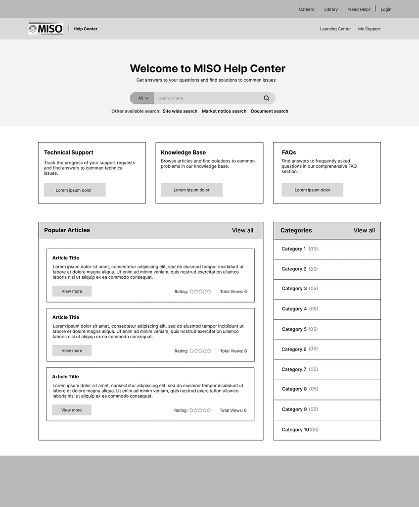
The wireframe for the Help Center's Home Screen focuses on creating an intuitive and user-friendly interface. The design includes a clean and organized layout, with the following key features:
Header:
MISO Energy logo for clear platform identification.
Quick navigation links to 'Knowledge Base,' 'Support Tickets,' and 'My Account.'
Search Bar:
Prominent placement at the top for quick search initiation, aligning with user need for efficient search.
Popular Articles:
Section below the search bar highlighting important articles and announcements for easy access.
Categories and Topics:
Main body organizes knowledge articles by topics for structured exploration.
User-Friendly Onboarding:
Onboarding banner for new users to guide initial steps and enhance first-time experience.


Easy Navigation: Market participants need an intuitive way to browse and find information quickly without frustration.
Advanced Search: The Help Center should offer advanced search functionality with relevant, customizable results.
Multimedia Resources: New users need access to videos and interactive tutorials for understanding complex energy market concepts.
Tailored Content: Provide content for varying expertise levels, from beginner to advanced.
Seamless Integration: Integrate the Help Center with other MISO Energy platforms for unified access to information and support.
User Needs
Functional Requirements for MISO’s Help Center Portal
Our extensive analysis reveals critical functionality and usability issues in the Help Center. The lack of real-time support ticket updates, challenges in article accessibility, outdated content, and device compatibility hindrances directly impact user experience.
"Re-designing the MISO Energy Help Center to empower users with seamless navigation and intuitive layout while enhancing article discoverability and search experience to redefine user satisfaction and reliability.”
Streamlined Navigation: Enhance menu structures and link styles for better usability.
Optimized Layout: Redesign the front page for easy article access, clear link styles, immediate FAQ access, and effective feedback.
Updated Content: Ensure information is current and accessible across devices with responsive design.
Focus Areas
The Home Screen wireframe maintains a clean and user-centric design. The prominent search bar at the top ensures that users can initiate their search promptly, addressing the issue of search functionality. We've added a user-friendly login option, a quick access button to FAQs, and a visible support ticket status indicator for 'Sarah' to easily track her queries. The main content area will dynamically display featured articles, which is a step toward addressing 'Mike's' need for clear categorization and onboarding.
Design Rationale
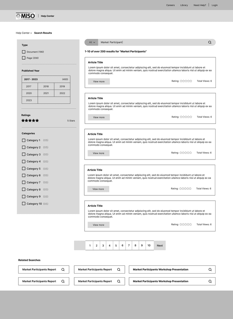
Search Screen Wireframe:
The Search Page wireframe is centered around delivering an efficient and effective search experience for users:
Search Results - The page presents search results in a clear and organized manner, with concise titles and descriptions. Users can quickly scan the list to find articles that match their query.
Filter and Sort - To further refine their search, users can utilize filter and sort options on the left side. They can filter results by categories, publication date, or relevance, enhancing the discoverability of relevant articles.
Pagination - Pagination at the bottom of the page enables users to navigate through multiple search results pages seamlessly.
The Search Page wireframe streamlines the search experience, improving discoverability for knowledge articles. Users can enter their queries and use filters to refine search results. The left sidebar offers category options for better categorization, while the right panel provides a detailed view of articles. This addresses 'Sarah's' struggle with finding relevant articles and serves as an initial step towards improved categorization.
Design Rationale
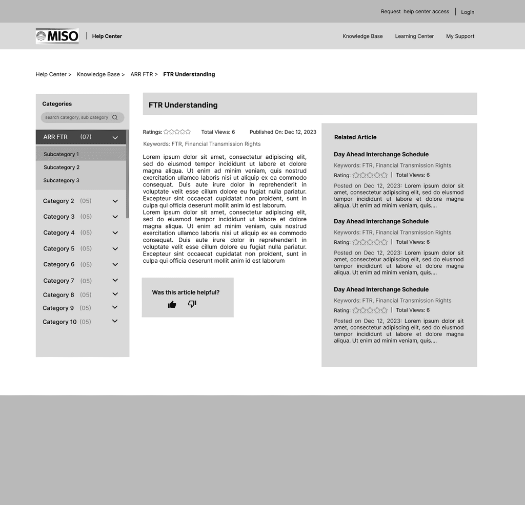
Knowledge Article Screen Wireframe:
The wireframe for the Knowledge Article aims to create an easily navigable repository of articles:
Categories - On the left panel, users can explore categories and subcategories, making it straightforward to browse knowledge articles.
Article View - Clicking on an article title opens the detailed view, presenting the article's content in an easily readable format. Users can also rate the article and provide feedback.
Related Articles - The right panel suggests related articles, promoting further exploration and helping users find additional information on the same topic.
The Knowledge Base Wireframe introduces a structured knowledge repository. It categorizes articles and provides a clean layout for easy browsing. Users can explore articles by category or search for specific topics. This design element aligns with the goal of clearer categorization and easy navigation, benefiting both personas 'Sarah' and 'Mike.'
Design Rationale
Key Developments and Design Decisions (Mid-fidelity)
Enhanced Search Box Functionality

We revamped the search box based on usability feedback, enhancing its visual design for clarity and ease of use, ensuring users can navigate it intuitively. Additionally, we introduced a 'Popular Searches' section beneath the search box, showcasing related keywords and phrases. This new feature guides users towards frequently searched topics, facilitating quicker and more efficient information discovery, reducing effort in finding relevant content, and encouraging exploration within the Help Center.
Revamped Help Center Home Layout

In response to feedback regarding the initial overwhelming nature of the homepage, we implemented a significant redesign.
We resized the cards to create a more streamlined and less cluttered appearance. Central to the homepage is now a prominently placed information card, designed to capture users' attention immediately with crucial updates or features.
Simplified Feedback Mechanism in Knowledge Articles


We replaced the 5-star rating system with a 'thumbs up or down' feedback mechanism based on user preferences for a simpler, quicker feedback method. This aligns with trends in minimalist, binary feedback design, simplifying user interaction while still collecting valuable content insights.
Furthermore, an alert banner was added at the top of the website to display urgent notices or important information, ensuring high visibility and immediate user awareness. This design choice balances a user-friendly interface with efficient information presentation, enhancing user experience without causing sensory overload.
The primary objectives of our user study are to:
Understand user interaction with the current Help Center layout and identify pain points.
Evaluate the effectiveness of the proposed design changes in addressing these pain points.
Measure user satisfaction with the new design and gather feedback for further iterations.
Usability Testing
Usability Testing Methodologies
Think-Aloud Protocol with Task-Based Activities
Objective
To gain insights into users' thought processes and identify any usability issues as they navigate through the Help Center.
Process
Preparation - Develop a set of tasks that cover various aspects of the Help Center (Mid - fidelity prototype), ensuring they are representative of typical user actions.
Execution - Conduct sessions where users are asked to verbalize their thoughts while completing the tasks. A moderator facilitates the session, encouraging users to keep verbalizing their thoughts.
Recording and Analysis - Sessions will be recorded (with consent) for later analysis. The focus will be on identifying patterns, frustrations, and areas of confusion.
Participant Engagement
Recruitment - Target 3 diverse users from the Help Center’s audience. Recruitment through direct outreach from Hannah itself.
Timeline - Conducted in the early phase of testing to guide subsequent design iterations. (Will be starting this week, with MISO Clients on the Middle fidelity prototype of Help Center flow)
Specific Tasks with System Usability Scale (SUS)
Objective
To quantitatively measure the usability of specific features within the Help Center.
Process
Task Selection - Identify key functionalities and design tasks that allow for a comprehensive evaluation.
Administration - Users will complete a series of tasks designed to test the interface's intuitiveness and efficiency. After completing the tasks, users will fill out the SUS questionnaire.
Execution - Users complete tasks independently. Following task completion, users will fill out the SUS questionnaire.
Analysis - Calculate SUS scores to provide an overall usability metric, complemented by observations from task completion.
Timeline - Administered following the think-aloud protocol to quantify usability improvements and pinpoint areas needing refinement.
First-Click Testing
Objective
To understand initial user interactions and the intuitiveness of the navigation.
Process
Scenario Development - Create realistic scenarios that prompt users to engage with the Help Center.
Execution - Using first-click testing tools, track where users click first in response to each scenario.
Administration - Conducted remotely using specialized software. Users will be asked where they would click first to complete given tasks. This non-moderated session focuses on the user’s initial instincts.
Analysis - Evaluate data to identify navigation patterns, first impressions, and potential usability barriers.
Timeline - Scheduled after the specific tasks and SUS, allowing for evaluation of initial design modifications.
Participants
The usability testing involved three MISO Customer Support team members, leveraging their familiarity with the existing Help Center and their understanding of the target audience's needs. This diverse group of participants ensured that the feedback captured a range of perspectives and use cases.
UX Analysis of Usability Study Feedback
Evaluation & Summary of Testings
Search Flow Analysis
The search flow garnered positive feedback for its realistic results and user-friendly filter options. However, certain elements, such as the visibility of popular searches and the placement of navigation elements, indicated areas needing refinement.
Realism and Navigability: The prev/next functionality, appreciated for easy navigation of search results, aligns with Nielsen’s heuristic of User Control and Freedom, offering users a sense of control and predictability.
Filters and Sorting: Positive feedback on filter usability, reflecting Fitts’s Law, shows that making these elements easily accessible reduces user effort and enhances the search experience.


Popular Searches Visibility: The initial oversight of popular search terms highlights the heuristic of Visibility of System Status. Enhancing their visibility could streamline the search process by providing clear starting points.

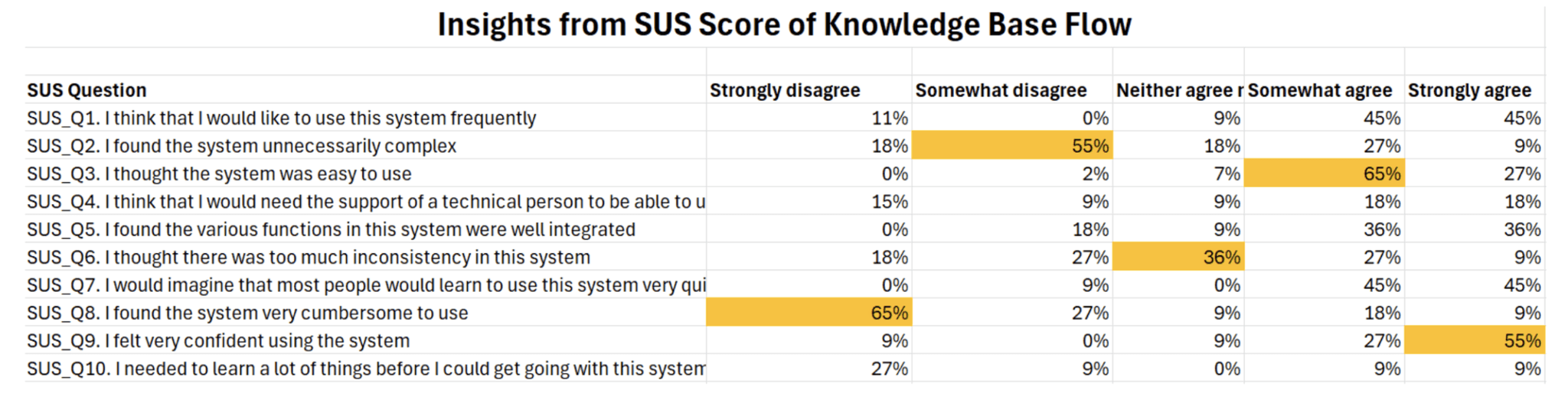
Knowledge Base Flow Analysis
The Knowledge base flow's feedback centered around article accessibility, content navigation, and the categorization system. The mixed reactions to article length, related articles' relevance, and category navigation suggest a need for design optimization.


Content Navigation and Layout: Users' tendency to navigate to the menu first supports the heuristic of Recognition rather than recall, showing a preference for intuitive paths that minimize memory recall.
Related Articles and Feedback Mechanism: Inquiries about related articles and feedback mechanism placement align with the Law of Common Region, indicating that related elements should be logically and prominently grouped to aid user understanding and interaction.
Category Navigation: Feedback on category scrolling and accessibility reflects the heuristic of User Control and Freedom, suggesting users want easy access to a wide range of information without feeling constrained by the interface design.
SUS Scoring Analysis

The System Usability Scale (SUS) scores tested with peer classmates to gauge general user experience provided quantitative measures of the usability of the redesigned Help Center's search and knowledge base flows.
Search Flow SUS Score
The search flow achieved an impressive SUS score of 87.5, indicating high usability and user satisfaction.
The two-sided 80% confidence interval for the search flow SUS score ranged from 88.3 to 86.7, further reinforcing the robustness of the design's usability.
Knowledge Base Flow SUS Score
The knowledge base flow obtained an SUS score of 85, which is considered an above-average score and suggests a positive user experience.
The two-sided 80% confidence interval for the knowledge base flow SUS score was between 86.07 and 83.92, representing a relatively narrow range and lending credibility to the score's accuracy.
High SUS scores for the search and knowledge base flows show the redesign's success in creating a user-friendly interface. These scores, along with qualitative feedback from usability testing, offer a comprehensive evaluation of the Help Center's improved usability.
First-Click Testing Analysis
First-click testing provided valuable insights into the initial user interactions and the intuitiveness of the redesigned Help Center's navigation and information architecture.
Popular Searches Visibility
65% of participants noticed the prominent placement of the popular search option during the first-click testing.
This result indicates that the redesign successfully addressed the issue of visibility and discoverability of popular search terms, aligning with the heuristic of visibility of system status.
Auto-Suggestions Utilization
Notably, 90% of participants navigated from the auto-suggestions feature instead of using the search button.
This finding highlights the effectiveness of implementing auto-suggestions, reducing the cognitive load on users, and streamlining the search process.
Post-Usability Test Design Changes
Based on usability testing, we made strategic changes to address pain points and incorporate user feedback, ensuring the design met high standards of usability and accessibility.
Search Flow Improvements
Enhanced search result navigation and filtering options, following Fitts’s Law for minimal interaction effort.
Made popular search terms more prominent, utilizing the heuristic of Visibility of system status.
Auto-Suggestions Utilization
Refined content layout and categorization to balance information density and navigational clarity, aligning with the Law of Proximity and Common Region for easier mental mapping.
Most middle-fidelity designs received approval and were converted to high-fidelity interactions within two weeks. We conducted first-click testing to validate changes and continuously improve the user experience, making the Help Center intuitive and user-centered.
Based on the feedback so far:
Compact Page Section: Reduced clutter by compacting the menu and header sections, expanding the visible content area.
Card Layout Adjustment: Modified card sizes and arrangements in the knowledge base to balance information density and accessibility.
Enhanced Navigation: Streamlined navigation between search and knowledge base flows, ensuring intuitive transitions and clearer categorization.
Final Screens Prototype
Incorporating the insights and feedback from the usability testing phase, the team finalized the MISO Energy Help Center redesign. The final prototype showcased the culmination of extensive research, analysis, ideation, and user validation efforts.
Key screens within the final prototype highlighted the most significant improvements and enhancements, such as streamlined navigation, advanced search functionality, personalized content, multimedia support, and adherence to accessibility standards.


Future Outlook
The redesigned MISO Energy Help Center enhances usability, accessibility, and user experience, but ongoing improvements are essential. Future considerations include:
User Feedback: Implement robust mechanisms to collect and analyze user feedback and behavioral data for ongoing improvements.
Emerging Technologies: Explore integrating natural language processing, machine learning, and virtual assistants for personalized support.
Responsive Design: Ensure the Help Center remains responsive and adaptive across various devices and screen sizes.
Community Building: Foster collaboration with features like user forums, expert Q&A sessions, and peer-to-peer knowledge sharing.
Industry Trends: Monitor and incorporate industry trends and best practices in user experience design and digital support.
Scalability: Ensure the Help Center's infrastructure can scale effectively with user growth and content volume.
By continuously seeking improvement, the MISO Energy Help Center can remain a leading resource in the energy market, providing essential support and knowledge to market participants.
Thank you :)
From AI, web3, fintech, and digital education, I’m always helping founders & companies build ambitious product & brand.
More case study coming soon